Jeffrey Weiss, Independent curator and critic
Explore the exhibition here.
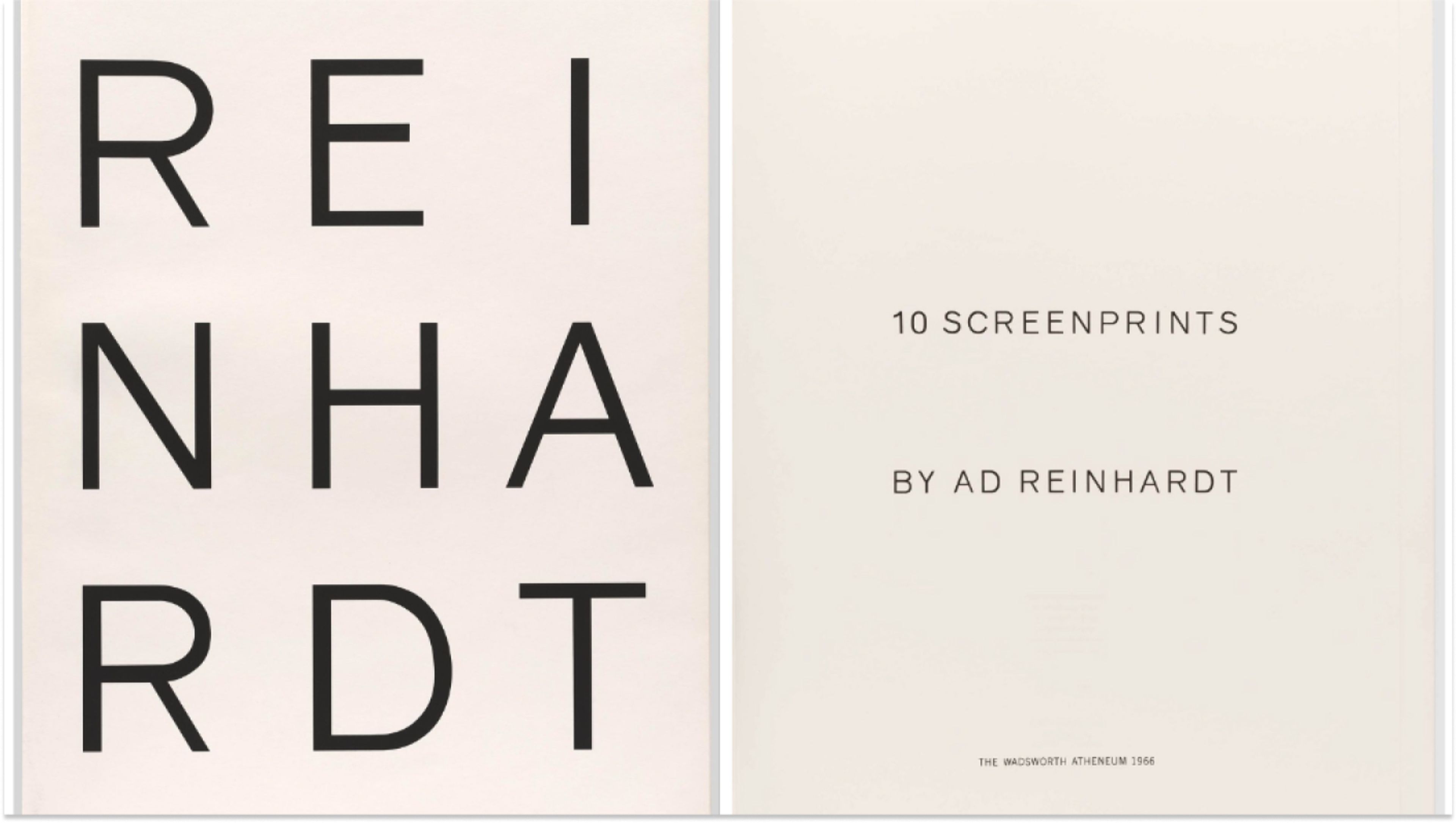
Folio cover and front page from Ad Reinhardt, 10 Screenprints, 1966. Screenprint on paper
Ad Reinhardt took up printmaking late in his career, producing a small but exquisite body of screenprints. These include several individual screenprints for portfolios of works by various artists and, most prominently, 10 Screenprints, a monographic suite commissioned by curator Sam Wagstaff for the Wadsworth Atheneum in Hartford, Connecticut, and published in 1966. This exhibition examines the relation of print to painting in Reinhardt’s practice, including factors of process, replication, and scale.
Reinhardt’s screenprints are, in and of themselves, hieratic icons of color and form, almost unique in printmaking of the era for being at once sumptuous and austere. Yet, as images, they are derived from his painted work. Since the early 1950s, the artist’s paintings had displayed a precise allocation of color and form. Surface structure is established by horizontal and vertical bars that interlock in strict—but not mechanically ruled—bilateral or tripartite configurations. Formats are alternately rectangular or square. Many of the works are monochromatic: red paintings, blue paintings, and “black” paintings, the latter composed of black mixed with red, blue, and green—colors so deep the distinction among hues can take time to discern. In an unpublished note, Reinhardt called these paintings the “early-classical hieratical red, blue, black monochrome square and cross-beam form symmetries of the fifties.”1 Alternatively, some paintings of the time show a configuration of multiple colors, though, here again, value intensity is always medium to low. The last seven years of Reinhardt’s life were devoted solely to the production of five-foot-square black paintings, all cruciform in design.
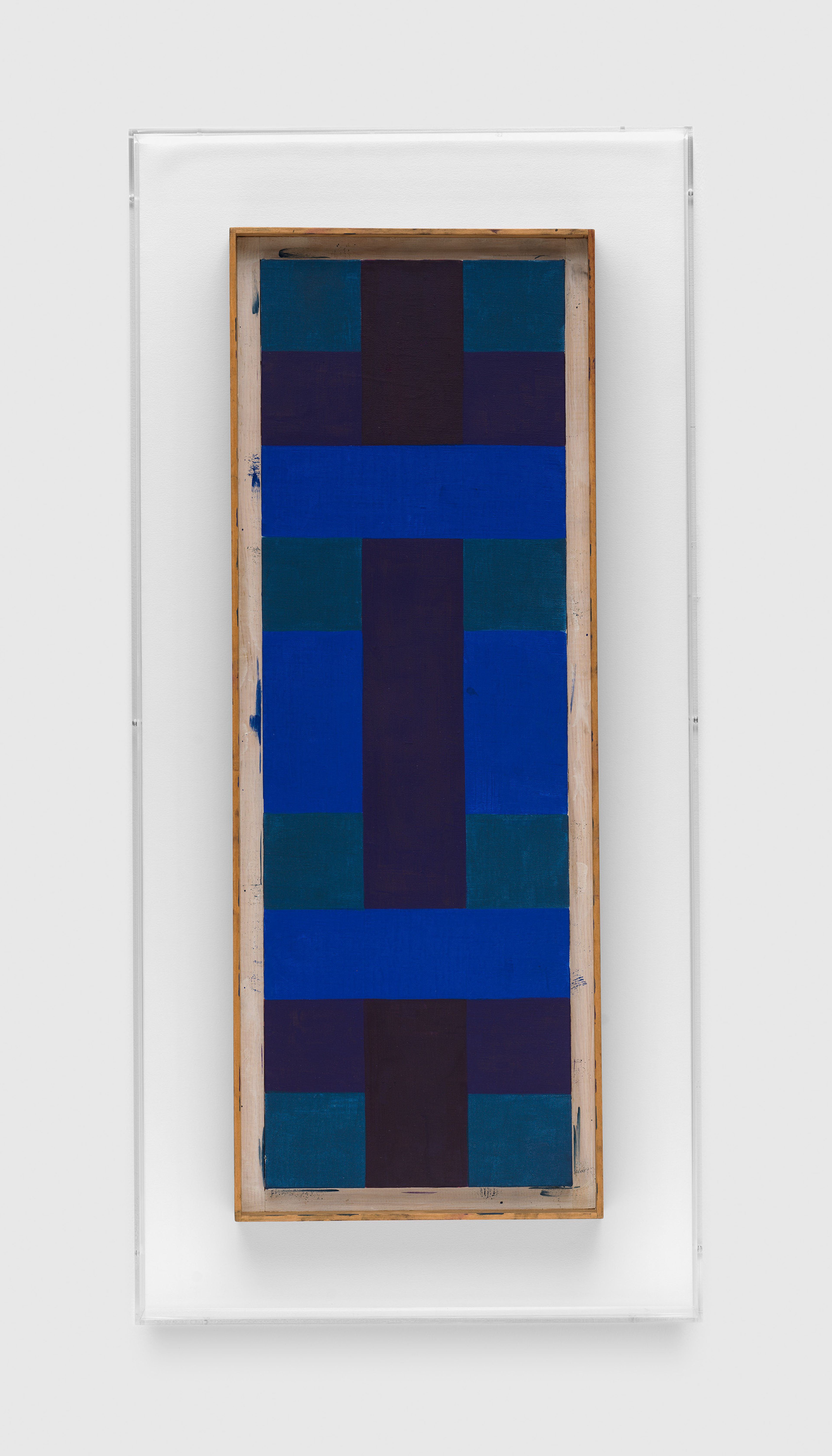
Ad Reinhardt, Blue Red Green, 1952. Oil on canvas
Reinhardt’s screenprints correspond to two types of painting. His first print, made for X + X (Ten Works by Ten Painters), a 1964 portfolio of prints by ten artists (also issued by the Atheneum), took the form of a black square. The individual screenprint of 1967 is a larger image of this kind. Conversely, most of the ten prints for the 1966 portfolio derive from paintings of the 1950s that are more complex in design and more explicit in color. There are eight vertical-format images; two are square, including the last print in the sequence of ten, which is another black square. Published as an edition of 250 and printed by Ives-Sillman in New Haven, Connecticut, the portfolio lies at the center of Reinhardt’s printmaking activity.
Reinhardt did not seek out printmaking but came to it by invitation. Anna Reinhardt, the artist’s daughter, now recalls that he considered it an engaging challenge.2 It was, as a technology, also somewhat familiar. As Elizabeth Reede has written, in the first and still most extensive academic text on the screenprints, Reinhardt’s early work as an editor and art director of magazines gave him a close acquaintance with commercial printing and graphic design.3 It is likely that he also welcomed printmaking as an opportunity to bring his work to a broad audience. Yet, considering the refinement of Reinhardt’s painting practice, he would not have undertaken the full portfolio if he hadn’t already learned—from making his first print—that it was possible to apply his exacting standards to the screenprint medium.
That is not to say that success was a given. Responding to a proof he received from his publisher, Rolf-Gunter Dienst, with whom he made the black screenprint in 1967, Reinhardt compared the technical frustrations of painting and print: “It seems you have the same trouble as I have in my painting,” he wrote. “Giving one black a different color sometimes makes it look darker or shimmer from one side, the opposite from another view.” In the final print, he said, there should be “no very obvious contrasts so that it looks like ‘horizontal-band’ or ‘vertical stripe’ or ‘cross-cruciform’ painting!”4 In other words, the design must be legible yet exceptionally discreet, qualities that distinguished Reinhardt’s black paintings but that would now require a trial-and-error process specific to printmaking.
Making screenprints demands the expertise of a master printer, but the process is also partly mechanical. The print matrix is a framed screen through which, using a squeegee, ink is forced onto the sheet. In Reinhardt’s case, precisely cut stencils (in fabric or plastic, for example) would have masked areas where the paper was to remain blank. Each color was printed with its own screen, requiring meticulous alignment—a registration of the various parts of the design. During production, proofs of each print were made for review by both artist and printmaker. In the context of Reinhardt’s work, the screenprint afforded an evenness of color, value, and surface and a straightness of edge not natural to working freehand. Given Reinhardt’s methodical application of the brush in his painting of the period, he surely appreciated this absence of an obvious authorial hand.
Reinhardt made two kinds of maquette to which the printer would refer when creating the screens. (A maquette, as opposed to a study, is a template for the printer to follow in producing the finished print.) The first kind, a painted work on paper, serves as a model for color.5 Nine of these maquettes for the print portfolio are extant. (There is no painted maquette for the last print in the portfolio; instead, Reinhardt probably used a small black painting in casein that he had made as the model for a previous black-square screenprint.6) The dimensions of each—both sheet and image—closely match those of the print to which it corresponds. The second kind of maquette is a ruled diagram of the design, each section inscribed with a letter or number indicating placement of color.
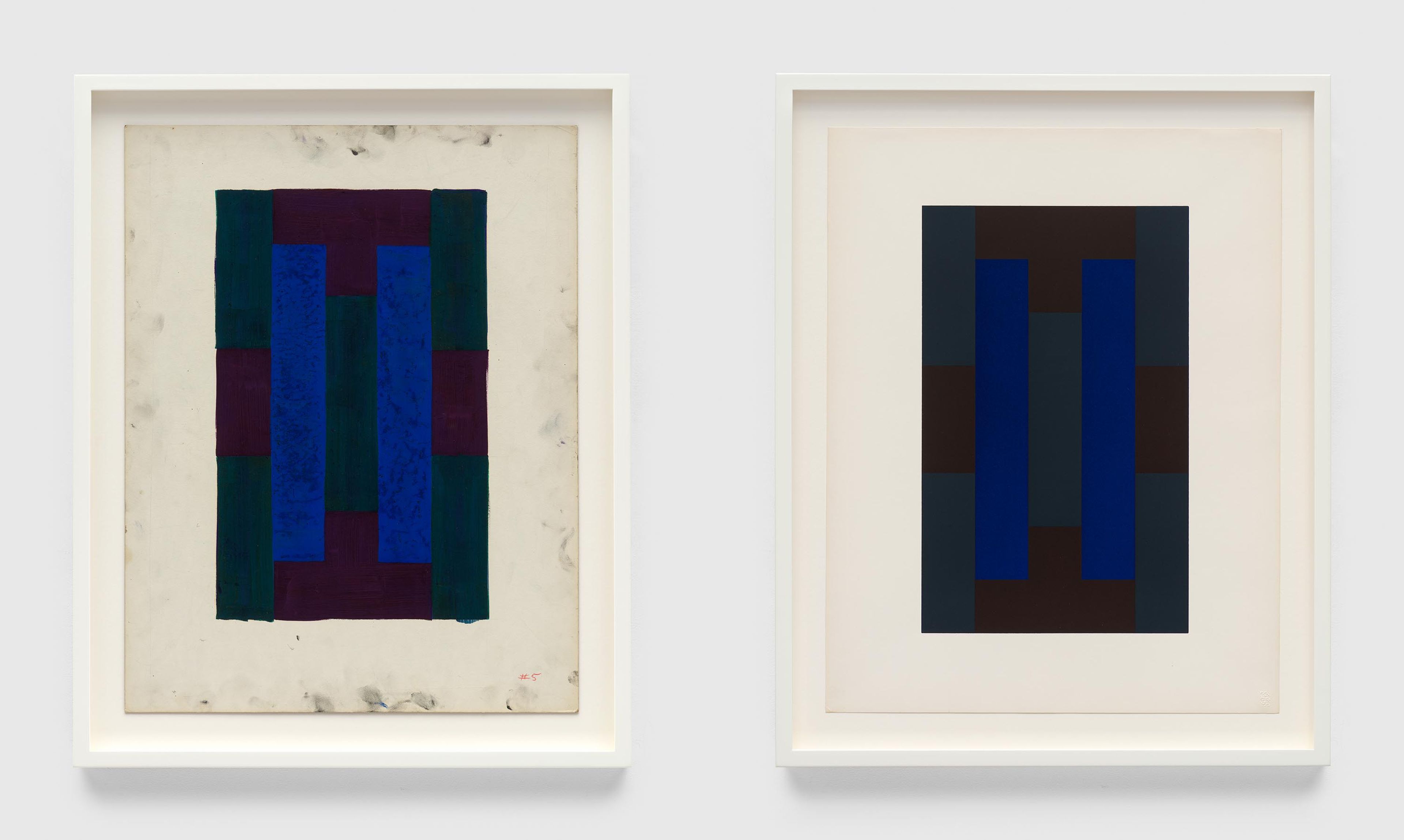
Ad Reinhardt, Untitled (maquette for Number 5 from 10 Screenprints), 1966. Oil on board; Ad Reinhardt, Number 5 from 10 Screenprints, 1966. Screenprint on paper
The maquettes are a mediating device through which the screenprints approximate, rather than imitate, Reinhardt’s paintings. First, from color maquette to screenprint there are conspicuous changes in palette, with hue and value contrast in the printed image being consistently more muted. This is partly owing to intrinsic differences between paint and printer’s ink in range and quality of color—but, importantly, the discrepancy was acceptable to Reinhardt. Secondly, the painted maquettes establish certain parameters for the material quality of the work’s surface. In his paintings, Reinhardt sought a matte surface. To this end, he developed his own formula for oil paint, which he mixed himself in jars, using a high ratio of pigment to binding medium. He probably used this kind of paint for the maquettes; while they were more rapidly and unevenly executed than the works on canvas, their dry surface quality is similar. Printer’s ink ranges from transparent to opaque; for the portfolio, Reinhardt and his printer chose an opaque formulation that is uninflected. Viewed in raking light, the inked image, which has a kind of dull luster, stands apart from the texture of the sheet. This uniformity is something of a cognate for the matte-paint surface of the works on canvas.7
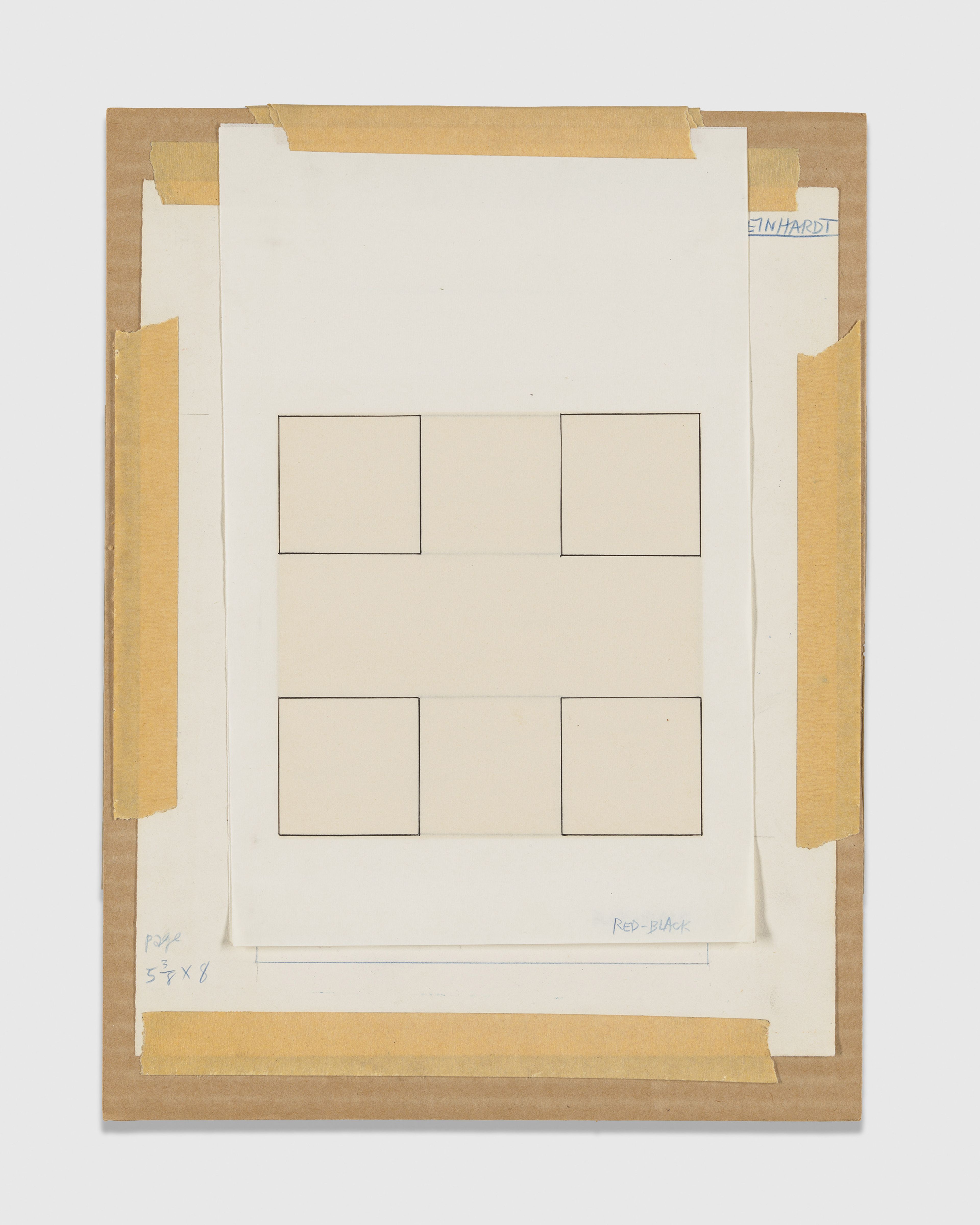
Ad Reinhardt, Untitled, n.d., Ink on three (3) pieces of paper. Digital Image © 2024 MoMA, N.Y. Photo by Martin Parsekian
All of this is to say that the relation of painting to print is one of equivalence. The second kind of maquette supports this idea. Many of the painted maquettes are somewhat broadly executed; their primary role concerns color and surface, not design. Instead, the diagrammatic maquette functions to make the coordinates of the design as exact as possible, minus color. Reinhardt applied this kind of diagram to painting as well. One was made for a series of six small black paintings on paper, 12-inch images on sheets measuring 26 x 20 inches overall. The paintings represent the six possible permutations of the contiguous distribution of red, blue, and green (with black) within Reinhardt’s standardized design and are numbered accordingly. The drawing contains quick sketches of each of the six options.
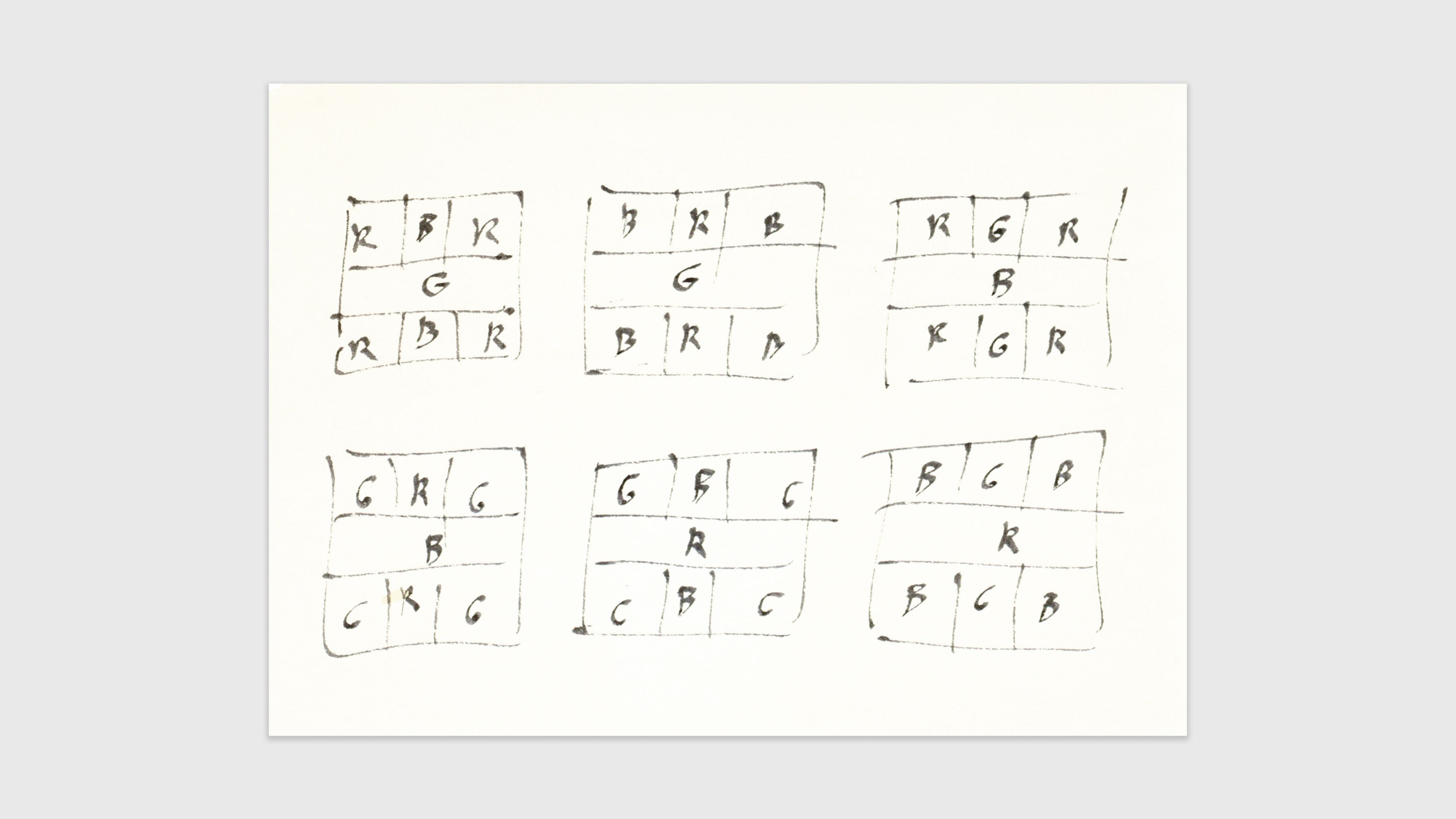
Ad Reinhardt, Drawing, c. 1960. Ink on paper. Ad Reinhardt Papers, Washington, DC. Series 6: Artwork, circa 1946, 1950, 1961, Box 4, Folder 12., Archives of American Art, Smithsonian Institution
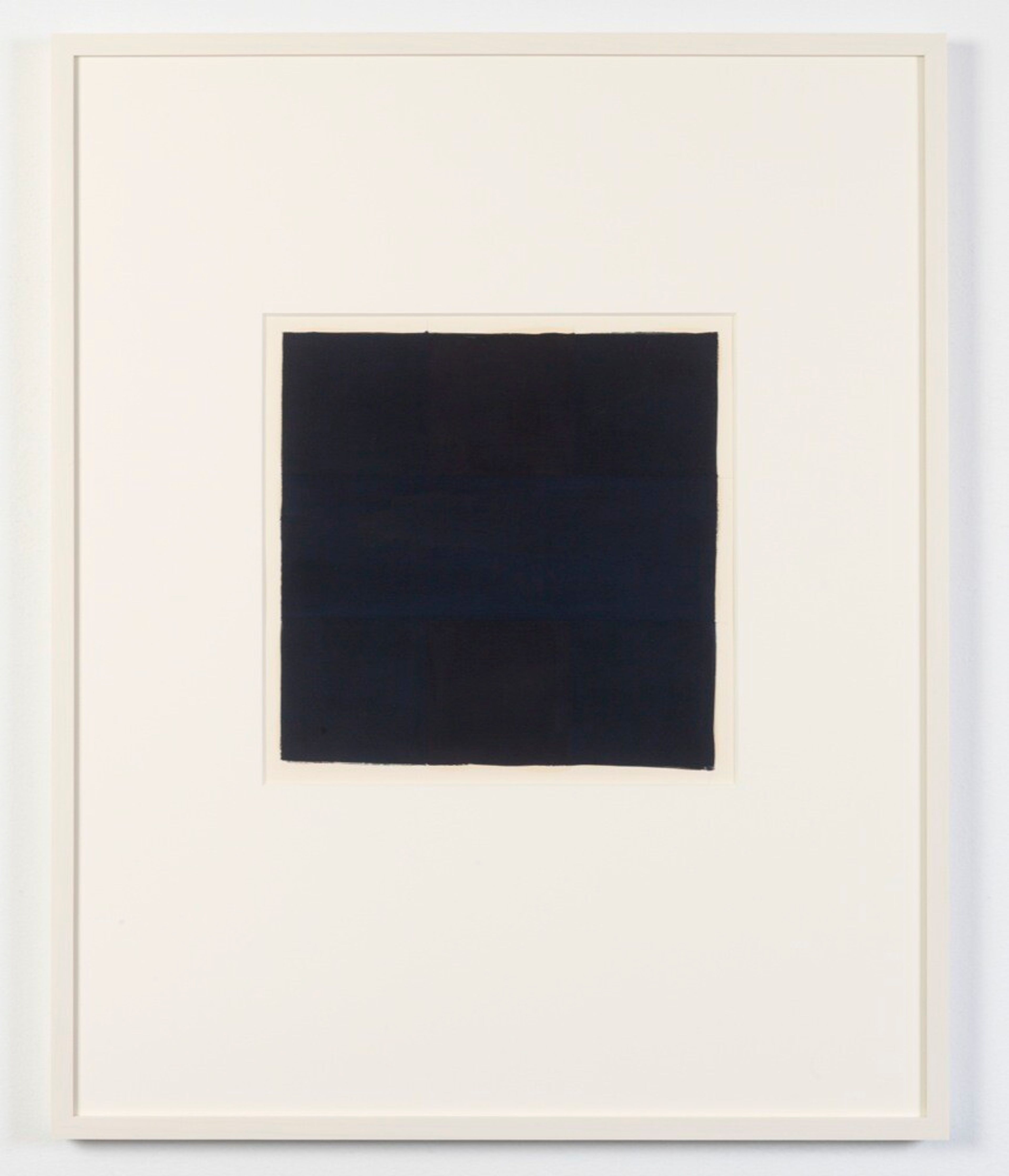
Ad Reinhardt, No. 4, 1960. Oil on paper in six parts. Private Collection
While their status is unclear, the group of six was exhibited once in Reinhardt’s lifetime,8 and the works should be considered together as a single permuting set. As such, they remind us of a further equivalence in Reinhardt’s late work: that of scale. Most of Reinhardt’s classic-period canvases measure in height or width roughly three or four to eight feet, even beyond. Yet he also made many small paintings, works on canvas that correspond in their dimensions to these works on paper, as well as to the prints (and to their painted maquettes). From small to large, configurations of design remain identical throughout, being scaled up or down accordingly. As a guide for the printer the diagram is a preparatory work, while in the case of the six small paintings on paper it might be considered as much a kind of legend or key. This double function reflects the elementary, almost maplike arrangement of form and color that Reinhardt’s works share regardless of size.
In the relation of print to painting, ambiguities of classification and scale are joined by those of replication. The artist’s paintings of the 1950s and 1960s are, in perceptual and material terms, so subtle that they defy reproduction on the pages of a book or magazine. The accuracy of the photographic image of a painting was something that, at times, he even attempted to improve, correcting a photograph by painting over it with gouache.9 But as a type, the black square implicates a different form of replication: the coidentity of print and painting as repeatable variants of a single pictorial scheme. In turn, in that prints are multiples, replication is intrinsic to their very terms. We call prints pulled from the same matrix examples—printmaking possesses its own language of that which is different but same.
These considerations bring us back to the print portfolio per se. In letters to the artist, Wagstaff proposed several things. First, relaying a suggestion made by Tom Hess, editor of Art News, he remarked that the artist might think of the ten prints as being “retrospective” in nature.10 Similarly, Wagstaff imagined a spread of red, blue, and black monochromes as well as “multi-color” images. Finally, he addressed the portfolio as a form, reminding Reinhardt that some collectors will probably examine the prints not just in isolation but in succession, as if in the pages of a book.11
Reinhardt was not completely averse to the retrospective as an idea. He consented to two such exhibitions of his work, including a large show at the Jewish Museum in 1966. It is useful to know that, at the artist’s behest, that exhibition was chiefly devoted to his late work.12 Yet on that occasion Reinhardt went so far as to produce a set of ninety-nine images drawn on seventy-five small slips of paper, each the size of a large postage stamp—rough copies of every painting on display. The images are surrogates, the kind of maquettes that museums use to plan the installation of a show in scale models of rooms. (The artist later pasted them in rows on a large sheet, a miniature survey of his career.13) That said, with respect to the state of his practice at the time the principle of esthetic progress was anathema to the artist. In unpublished notes from the period, Reinhardt characterized the black paintings—which he had been producing to the exclusion of everything else—as timeless. Both the design of the image and the repeated act of its making achieve a desired stasis, dispensing, in Reinhardt’s words, with traditions, conventions, and the history of forms. Put differently, Reinhardt’s practice was ongoing, but its development—the unfolding progress that is the stuff of the retrospective as a genre—had long come to a strategic end. The new edict: “repetition of formula over and over again until loses all meaning.”14
Wagstaff told Reinhardt that, on hearing of the forthcoming appearance of the portfolio, Robert Rauschenberg said, wryly but astutely, “Wouldn’t it be great if you could screen print six black Reinhardts almost all exactly alike!” It’s a choice Reinhardt might have made, one that suits the convergence of repetition, replication, and stasis—qualities that, in turn, suit printmaking’s terms.15 Does the numbered succession of prints and the booklike character of the portfolio imply, instead, a progression of some kind? The artist disregarded the retrospective model, although he did look back, retrieving a type of image that, in palette and design, he had otherwise left behind. Yet, in keeping with the state of his late practice, the result was iterative, not genealogical or nostalgic—a group of variants rather than a developing “history of forms.” This makes the portfolio a brilliant constellation of images. The impression is heightened by the whiteness of the sheet, which functions much like a wall, allowing the printed images to be controlled—with respect to placement, isolation, and orientation—in a way that the paintings never could be.
Nonetheless, another kind of change can be observed in the course of 10 Screenprints.16 After the first print, which is very dark, colors emerge in a higher key; then, with the last four prints, the artist introduced a lowering of value contrast and a deepening of color—a graduated stepping down. In this way, Reinhardt staged the black square, the portfolio’s final print, as a destination, the real and symbolic function it had already come to serve in his painted oeuvre. 1 Ad Reinhardt, “Five Stages of Reinhardt’s Timeless Stylistic Art-Historical Cycle,” unpublished notes, 1965, in Barbara Rose, ed., Art-as-Art: The Selected Writings of Ad Reinhardt (Berkeley: University of California Press, 1975), 10.
2 In my work on the artist, I have benefited greatly from the recollections and insights of his daughter, Anna Reinhardt.
3 Elizabeth Reede, “Ad Reinhardt: Visual Perception and the Screenprint Portfolios,” Print Quarterly 28, no. 1 (March 2011): 35.
4 Ad Reinhardt, letter to Rolf-Gunter Dienst, July 31, 1967.
5 Because of the matte-paint surface of the maquettes, the medium has often been referred to as gouache. Nonetheless, oil can be detected in some cases, having bled into the sheet. My thanks to Scott Gerson for this and other observations regarding the painted maquettes. Anna Reinhardt recalls that the artist responded to the printmaker’s early difficulties with color by obtaining small jars of printer’s ink and mixing colors himself, although there is little else we know about this process. Email to the author, May 7, 2024. In a 1964 letter from Wagstaff, mention is made of a “small swatch” of printer’s color samples that was sent to Reinhardt for his approval. Sam Wagstaff, letter to Ad Reinhardt, June 10, 1964, Ad Reinhardt Papers, Archives of American Art, Smithsonian Institution, Washington, DC. This sheet may be the one now in possession of the Yale University Art Gallery, New Haven.
6 Anna Reinhardt, conversation with the author, June 17, 2024.
7 As discussed by Reede, Wagstaff referred to the “dry surface” of the screenprints as being suitable to the painted work of those who contributed to X + X (Ten Works by Ten Painters), a roster that included Robert Motherwell, Frank Stella, and Andy Warhol. Wagstaff identified two qualities in particular: “flatness” and “the insistence of paint on the surface of the canvas.” Reede, “Ad Reinhardt: Visual Perception and the Screenprint Portfolios,” 34. That said, the differences in surface, palette, and articulation are as salient as the similarities.
8 The set was displayed in a group show, Amerikaanse Schilderijen Collages, an exhibition at the Museum Boijmans van Beuningen, Rotterdam, September 20–October 30, 1966.
9 See the discussion of the overpainted reproductions, or “photo-gouaches,” in Reede, “Ad Reinhardt: Visual Perception and the Screenprint Portfolios,” 38–39. On the relation of printmaking to Reinhardt’s broader concerns with mechanical reproduction, see also Jennifer Field, “Ad Reinhardt’s Prints,” The Brooklyn Rail, December 2013–January 2014, 104–6.
10 Samuel J. Wagstaff, letter to Ad Reinhardt, June 19, 1963, Ad Reinhardt Papers, Archives of American Art, Smithsonian Institution, Washington, DC.
11 Samuel J. Wagstaff, letter to Ad Reinhardt, July 27, 1965, Ad Reinhardt Papers, Archives of American Art, Smithsonian Institution, Washington, DC.
12 Similarly, in 1965, Reinhardt organized three simultaneous gallery exhibitions in New York, each dedicated to a single body of work dating from the early 1950s to the present: red paintings (Graham Gallery), blue paintings (Stable Gallery), and black paintings (Betty Parsons).
13 The sheet of maquettes recalls Reinhardt’s history in commercial print media. “When I was a newspaper staff artist I didn’t do any drawing at all one year. All I did was paste up nineteenth-century engravings from a small collection of clippings.” Ad Reinhardt, quoted in Bruce Glaser, “An Interview with Ad Reinhardt,” 1966–67, reprinted in Rose, Art-as-Art: The Collected Writings of Ad Reinhardt, 16.
14 Ad Reinhardt, “End,” unpublished notes, n. d., in Rose, Art-as-Art: The Selected Writings of Ad Reinhardt, 114.
15 Sam Wagstaff, letter to Ad Reinhardt, February 11, 1965, Ad Reinhardt Papers, Archives of American Art, Smithsonian Institution, Washington, DC.
16 This shift of color and value within the portfolio has been remarked by others. See Field, “Ad Reinhardt’s Prints,” 105; and Brian T. Leahy, “Ad Reinhardt’s Narrative Vision,” Art in Print 8 no. 3 (September–October 2018): 15–17.