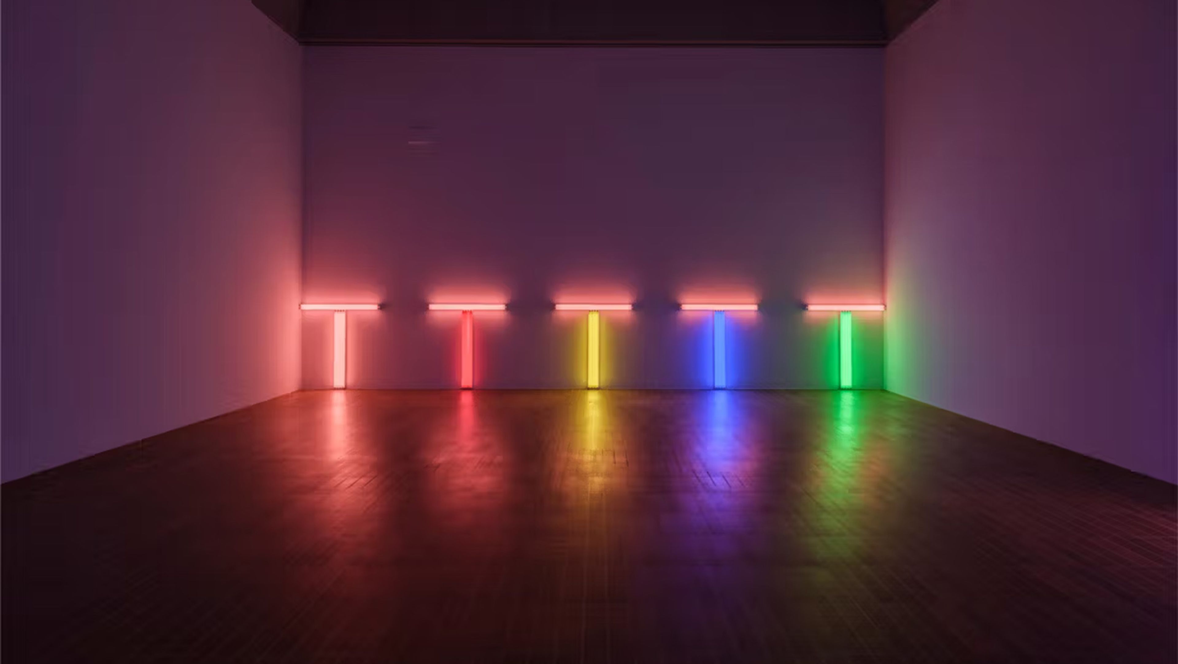
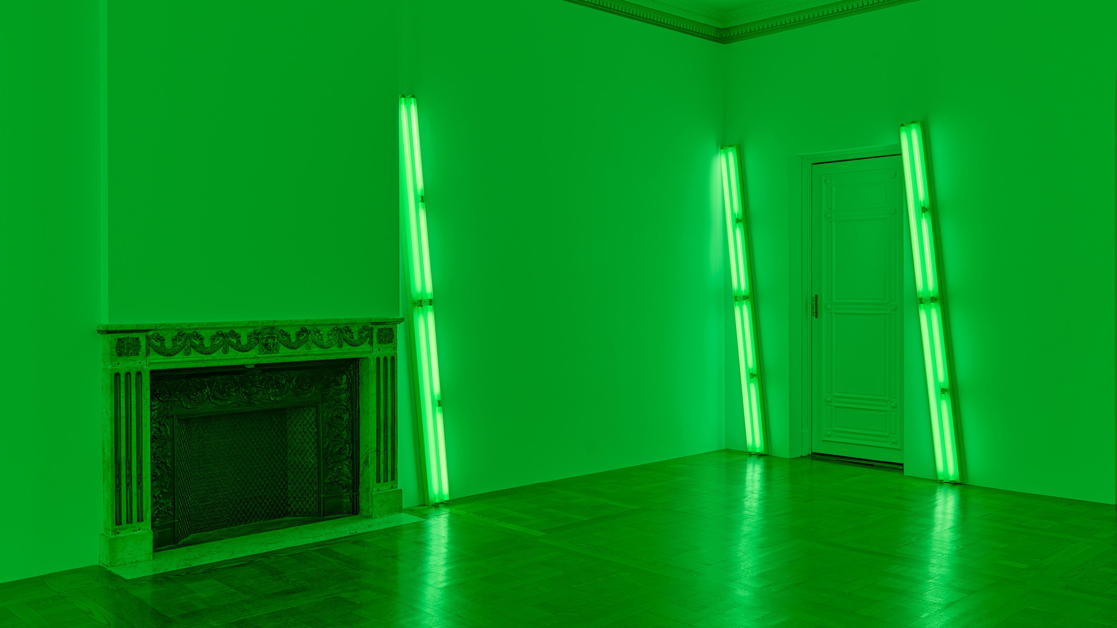
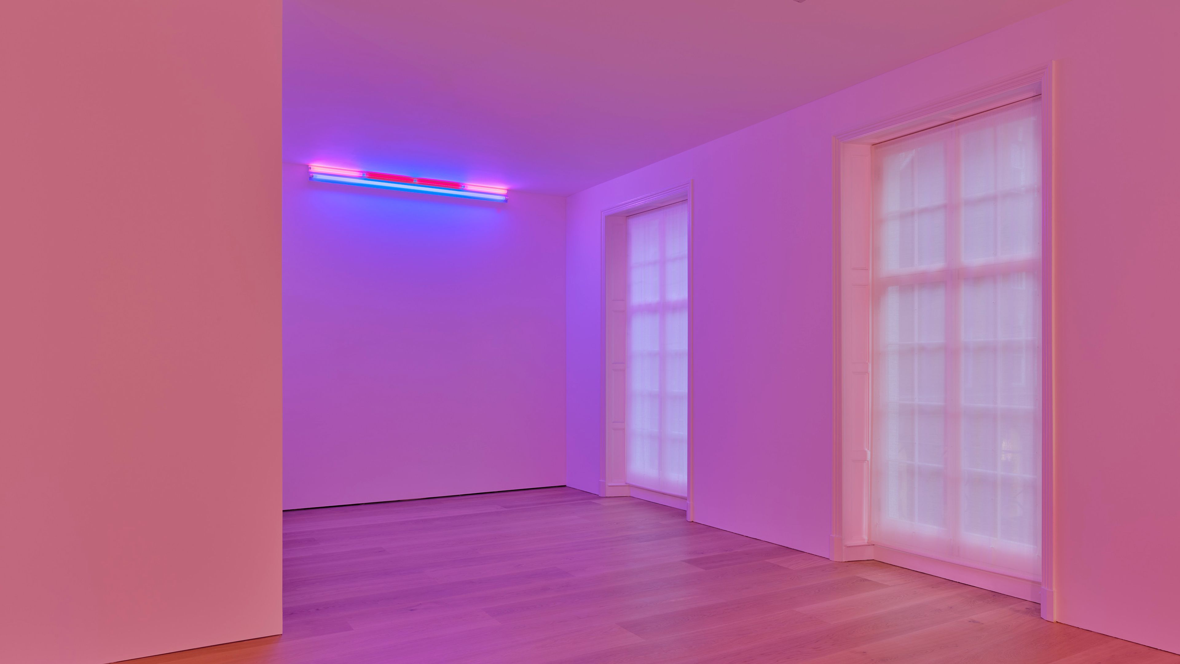
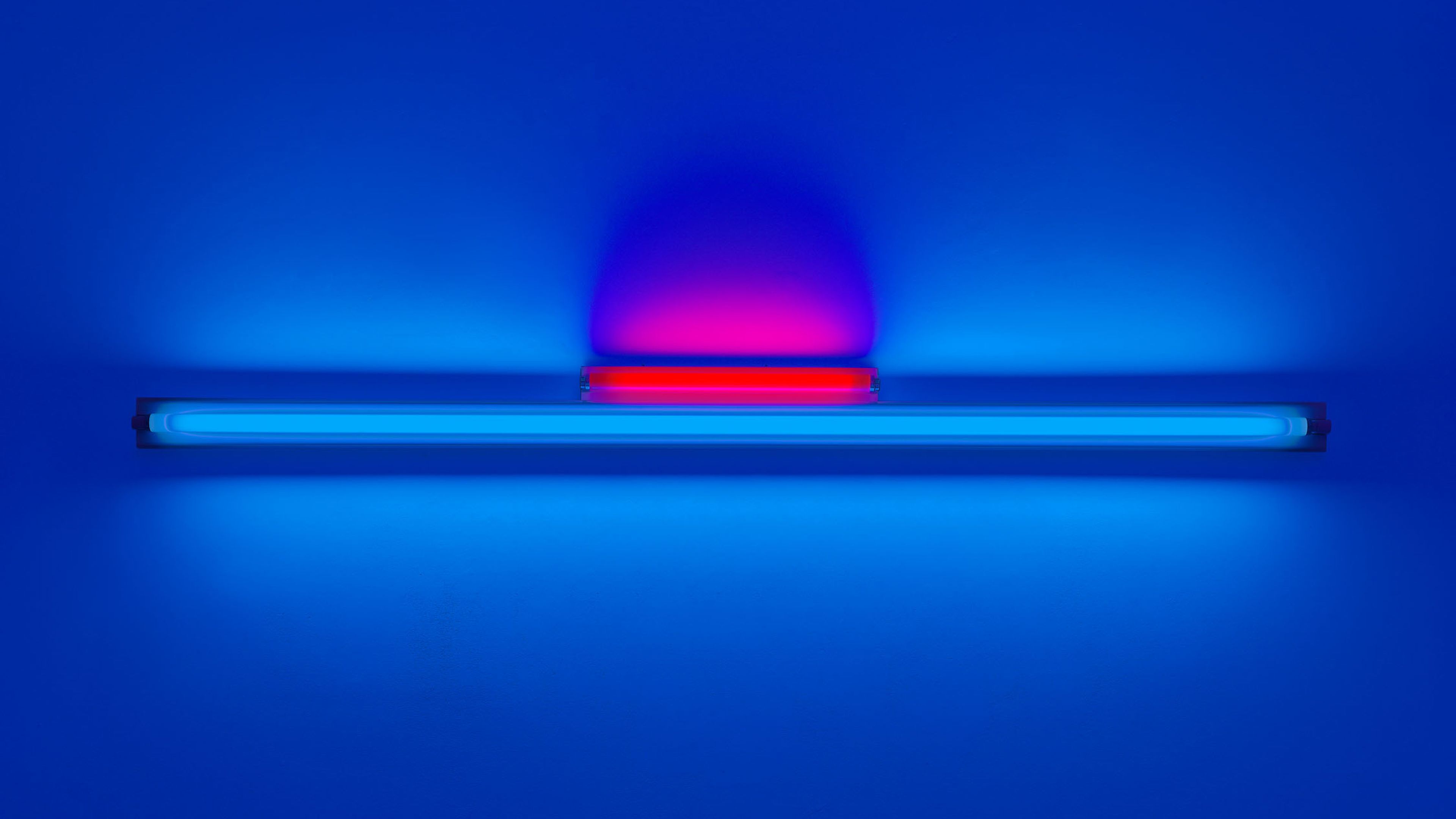
Dan Flavin Featured in The Art Newspaper
'Basel shines a spotlight on Dan Flavin' by Emmanuel Grandjean
2024
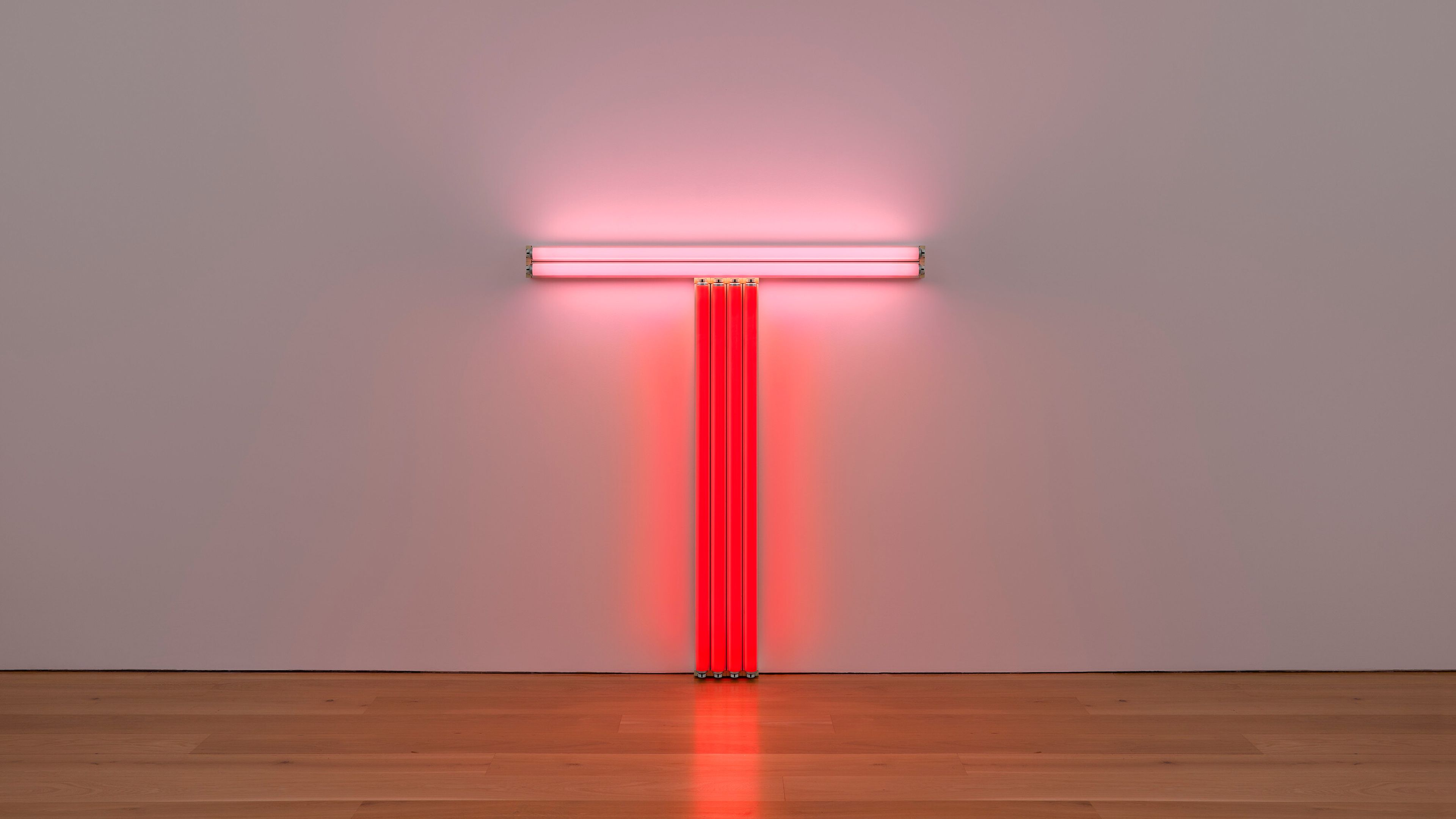
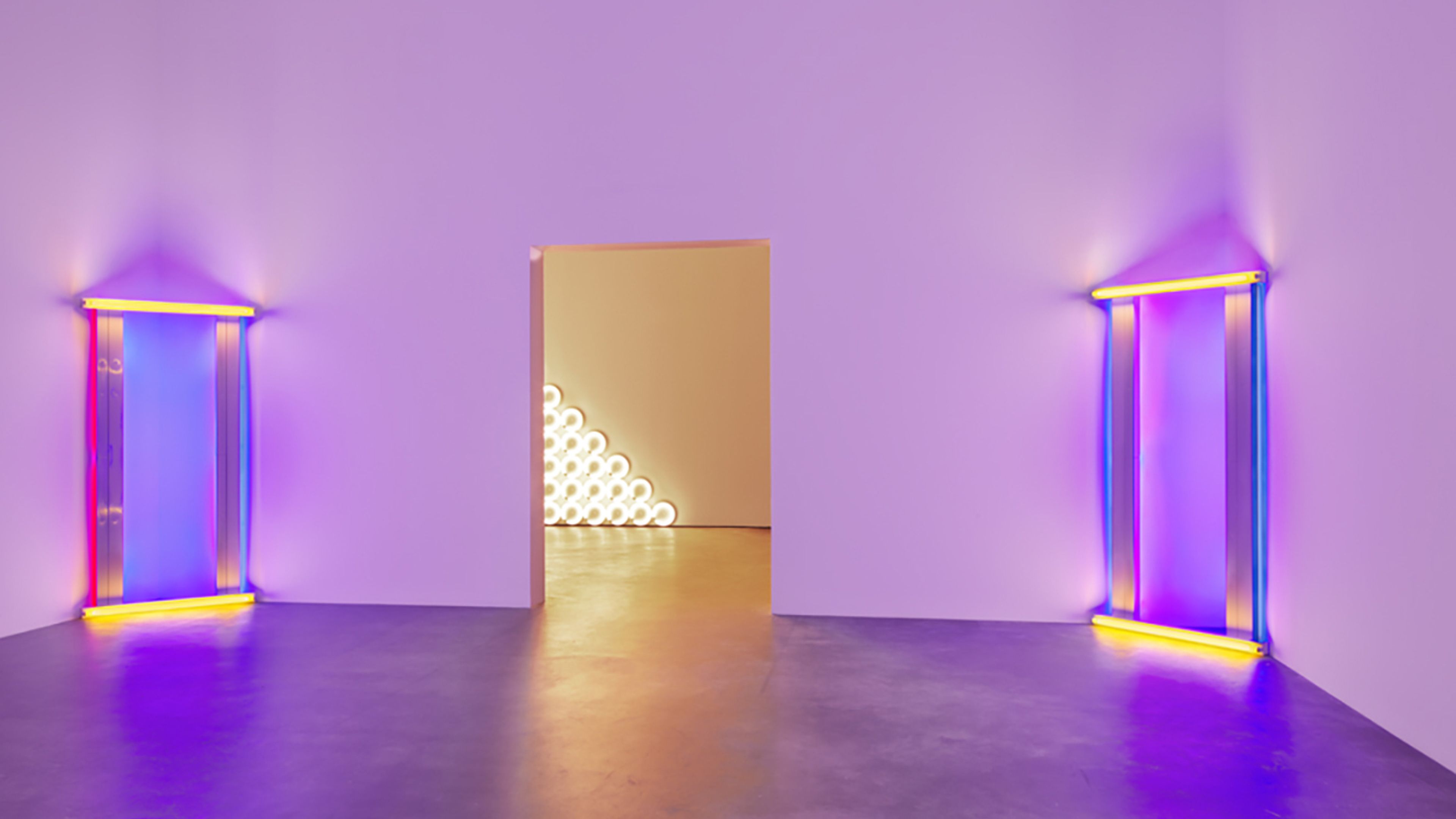
Dan Flavin Featured in Galerie
'5 Pivotal Works by Light Artist Dan Flavin' by Jane L. Levere
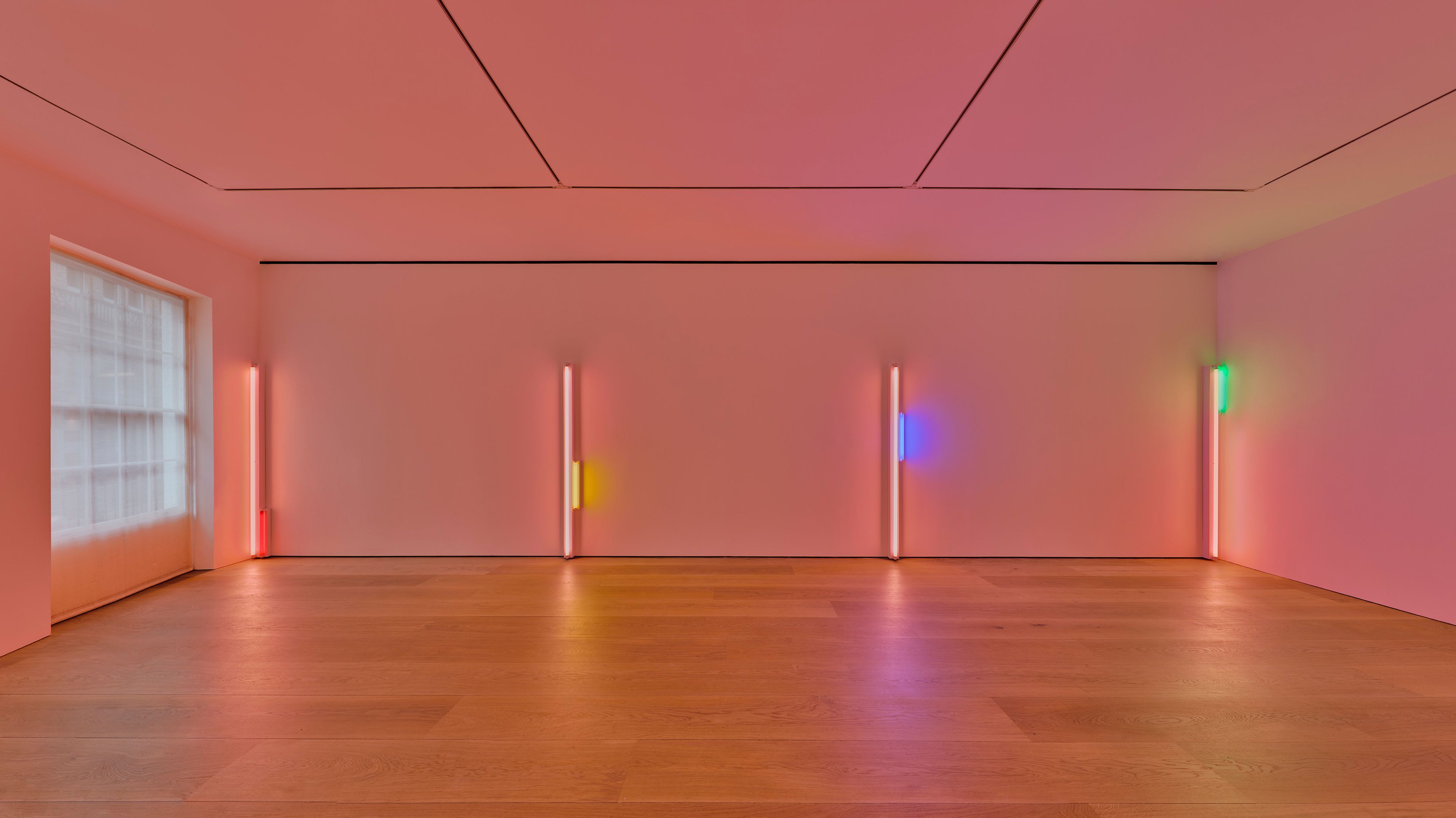
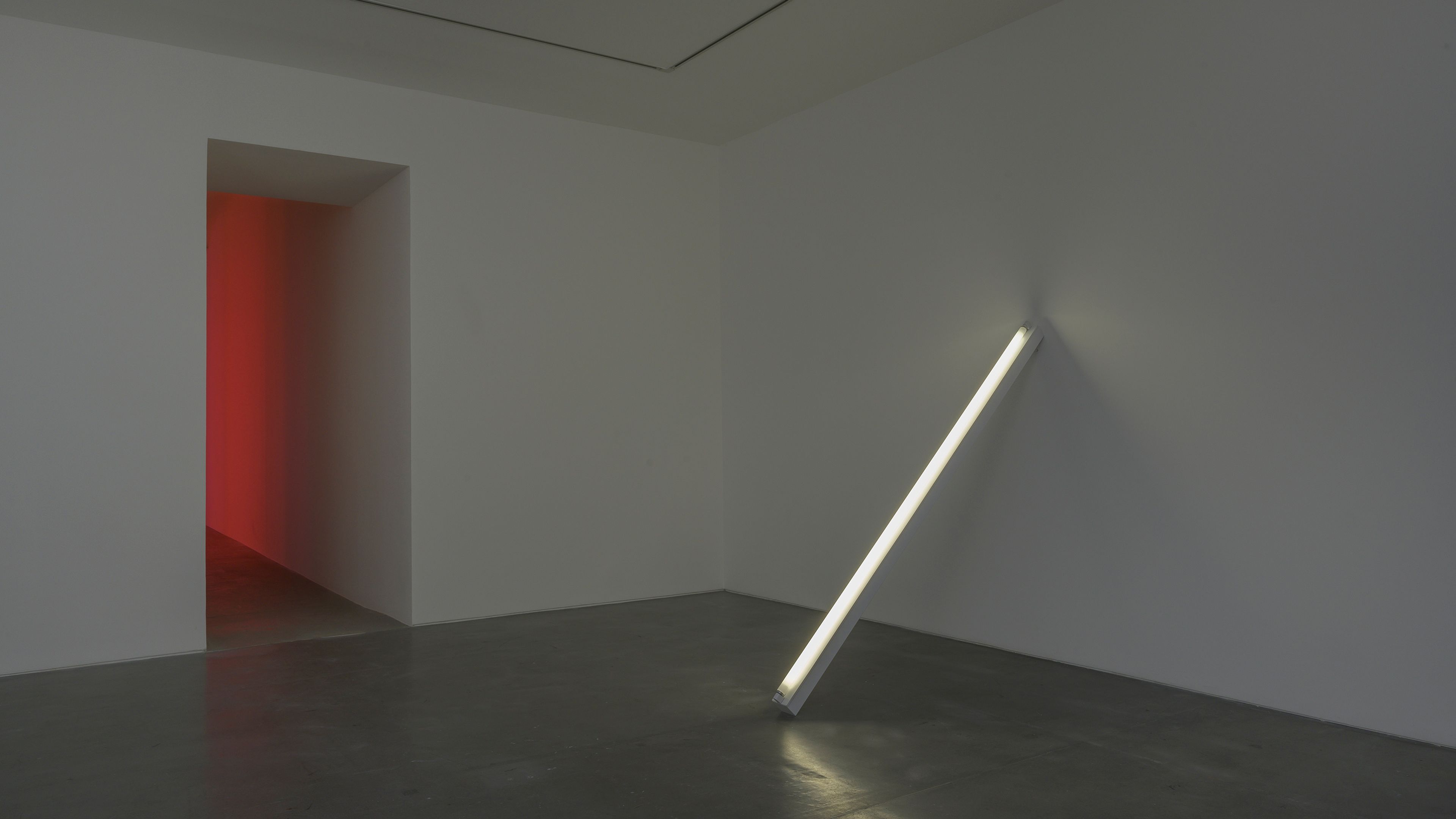
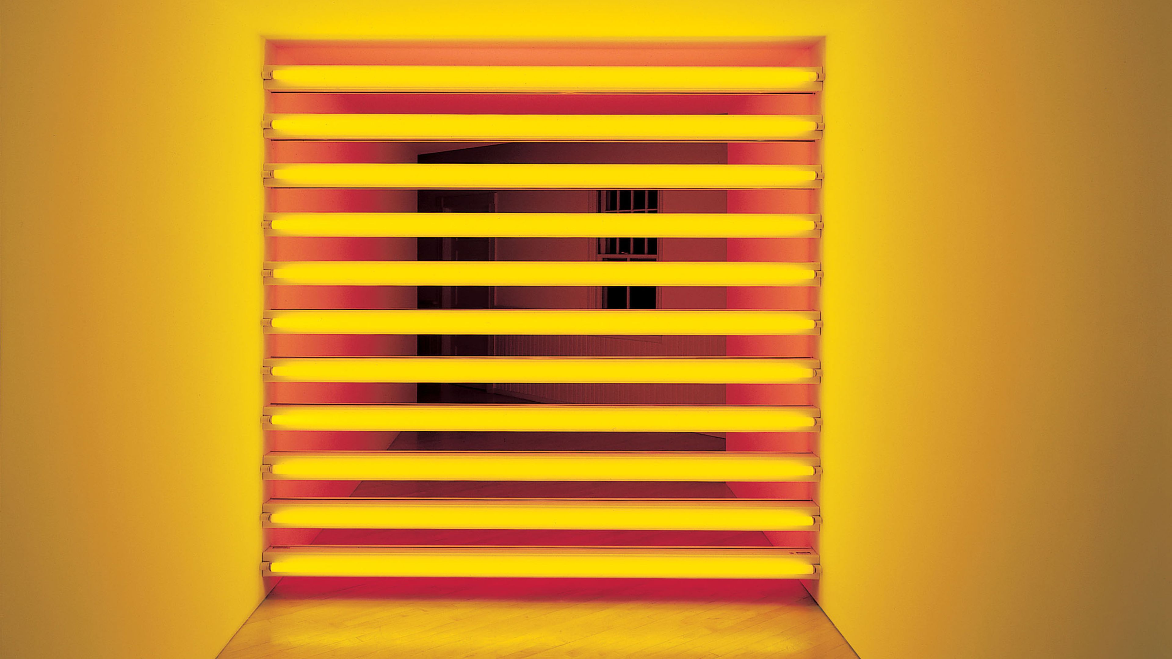
Dan Flavin Featured in Apollo
'Dan Flavin: Dedications in Lights' by Apollo
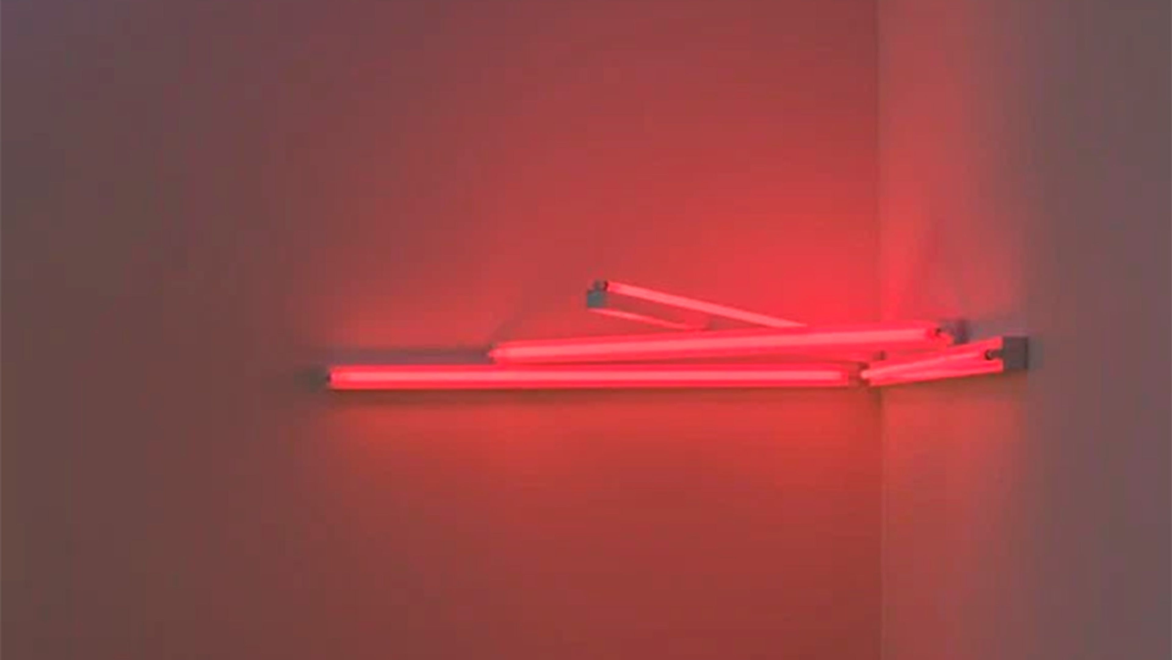
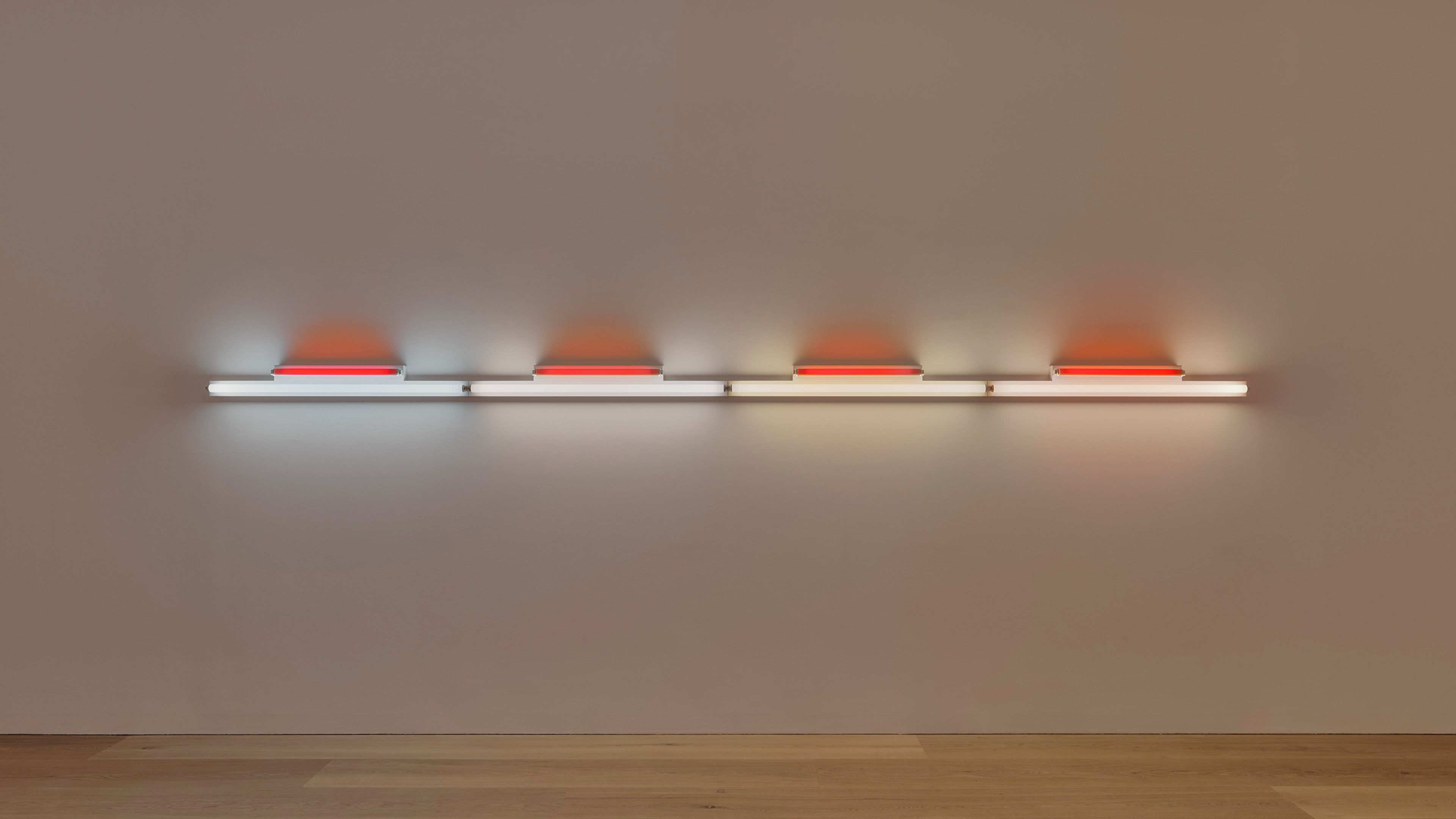
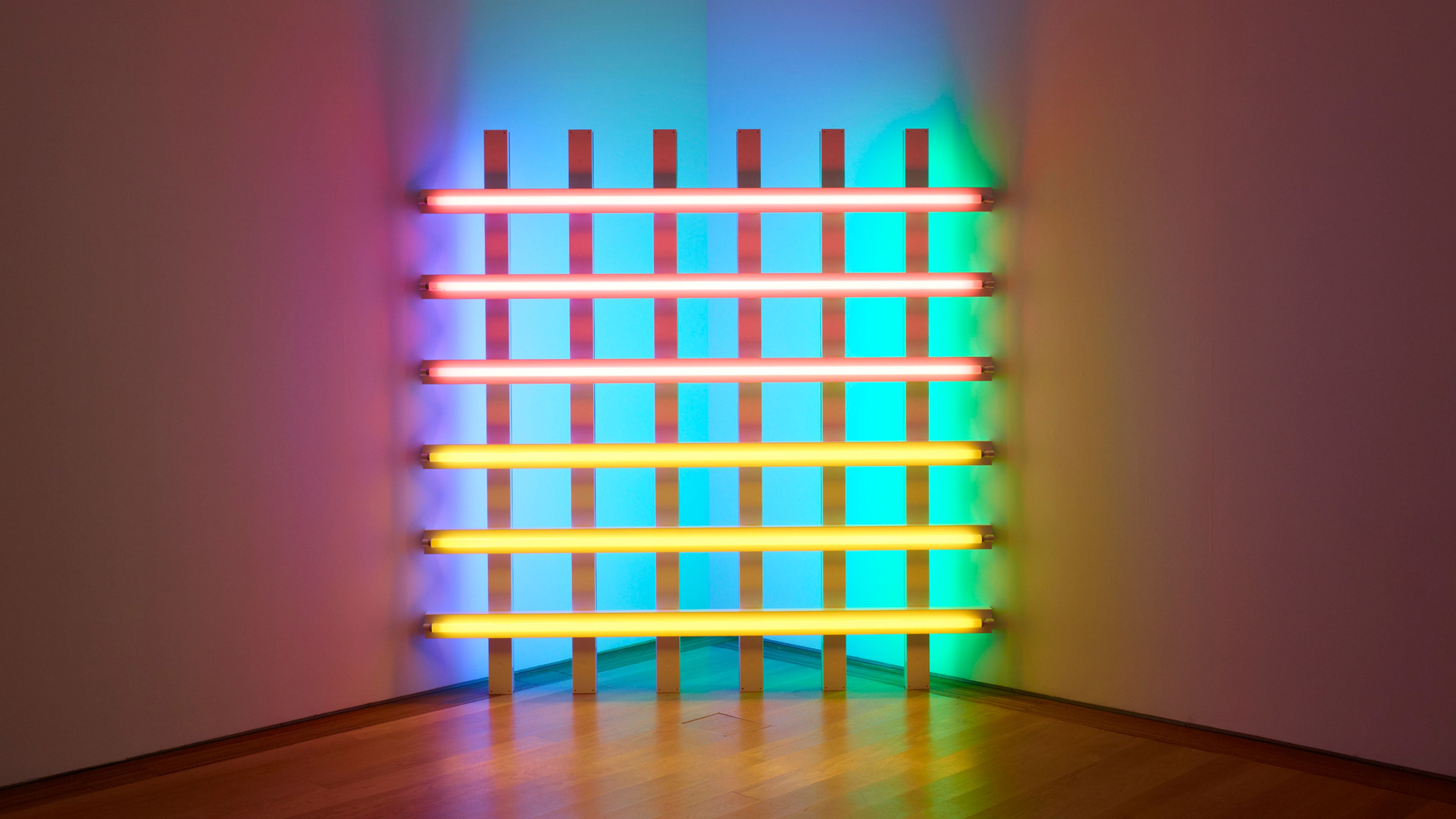
Dan Flavin Reviewed in Wallpaper*
'Dan Flavin’s fluorescent lights light up Basel' by Amah-Rose Abrams
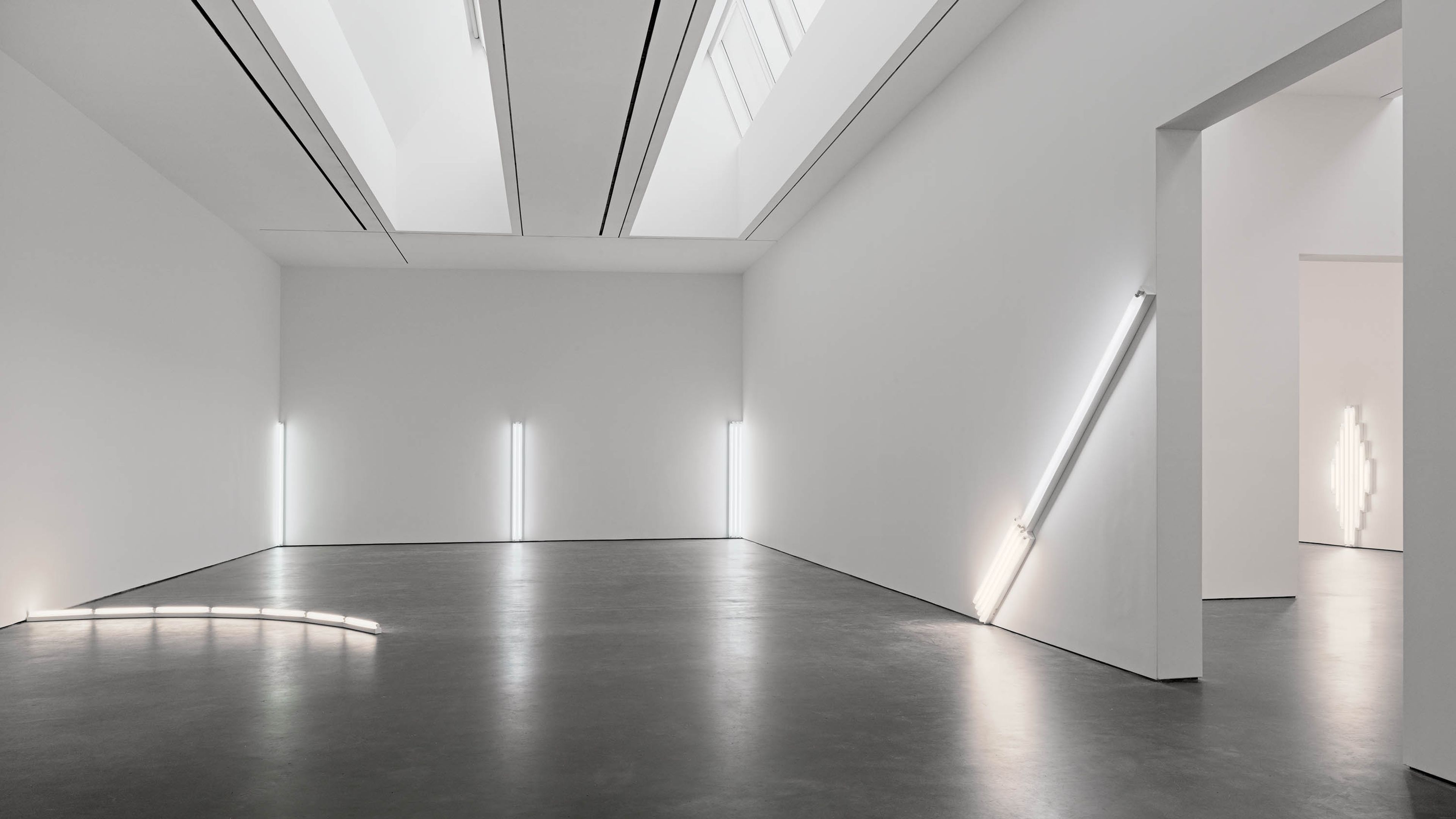
Dan Flavin Reviewed in the New Yorker
'When Dan Flavin Saw the Light' by Jackson Arn
2023
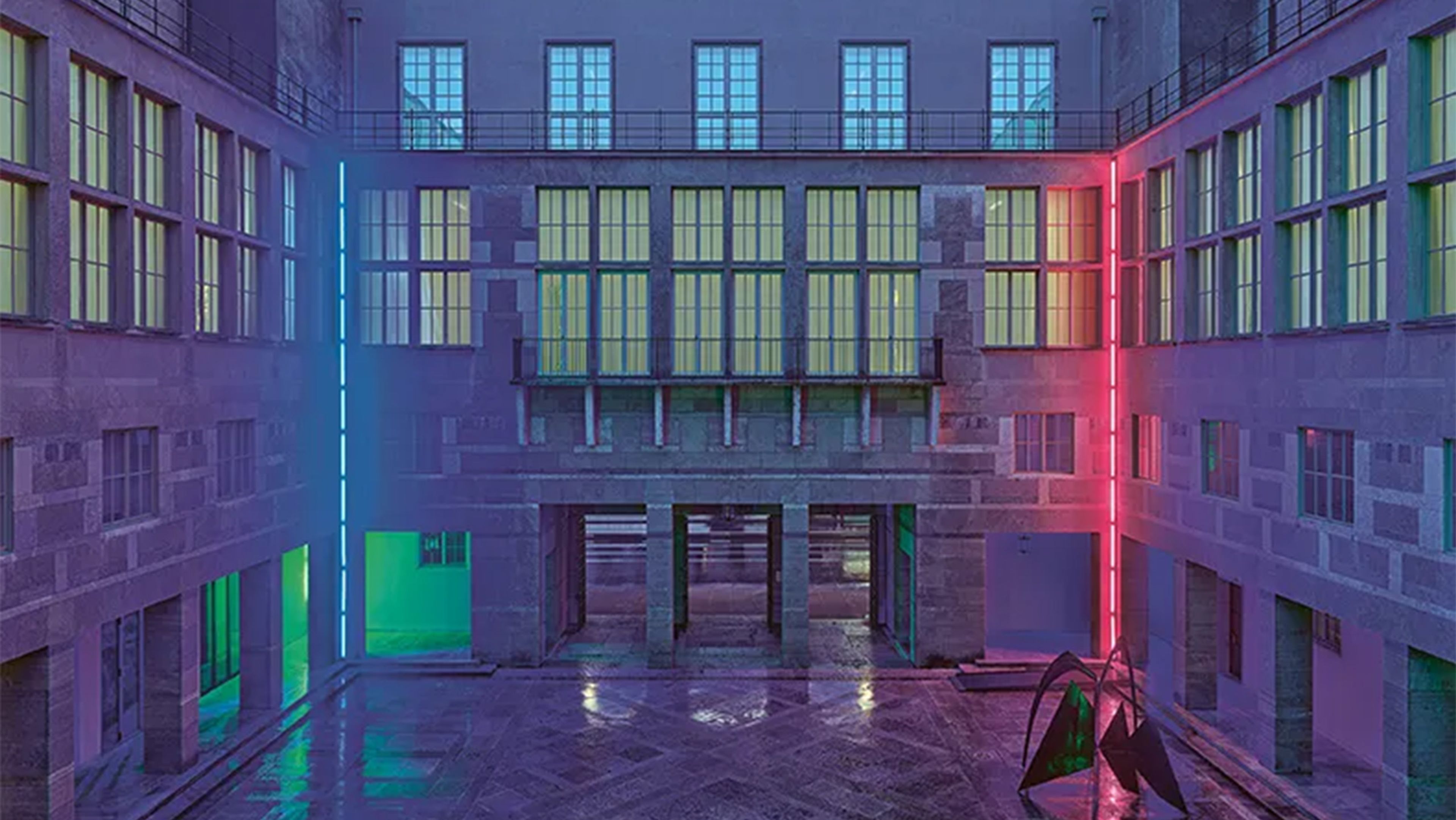
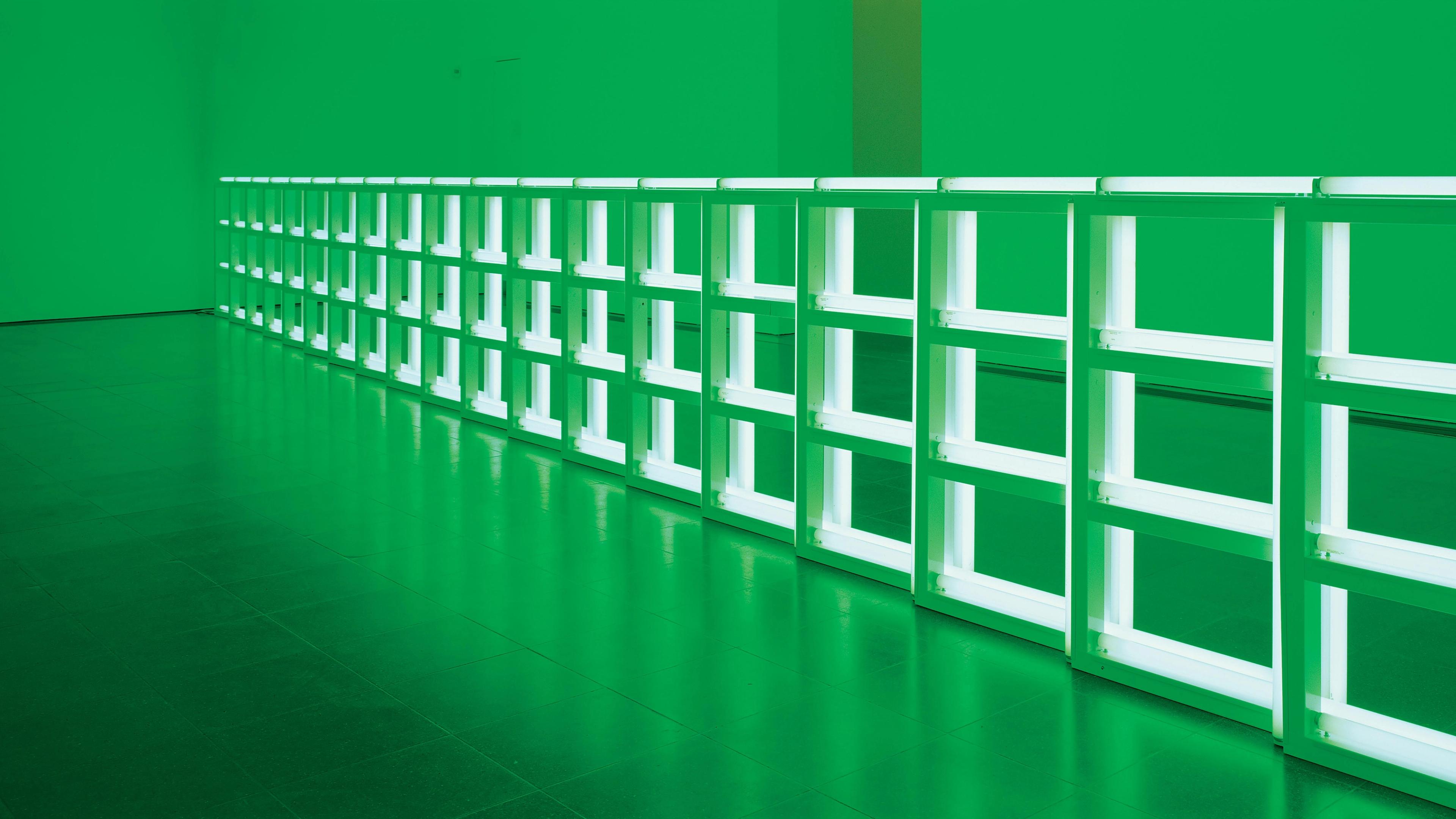
Dan Flavin Featured in The Telegraph
'From Sex Shops To Swanky Galleries: How Neon Art Became Red-Hot' by Samuel Reilly
Dan Flavin Reviewed in Time Out London
'Dan Flavin: colored fluorescent light’ by Eddy Frankel
Dan Flavin Featured in The Wick
'Viewing Dan Flavin: colored fluorescent light' by The Wick
Dan Flavin Featured in The Monocle
'Double Date' by The Monocle
Dan Flavin Reviewed in the Financial Times
'David Zwirner illuminates Paris with Dan Flavin' by Francesca Gavin
2019
Dan Flavin Reviewed in The New York Times
'What to See in New York Art Galleries This Week: Dan Flavin' by Roberta Smith
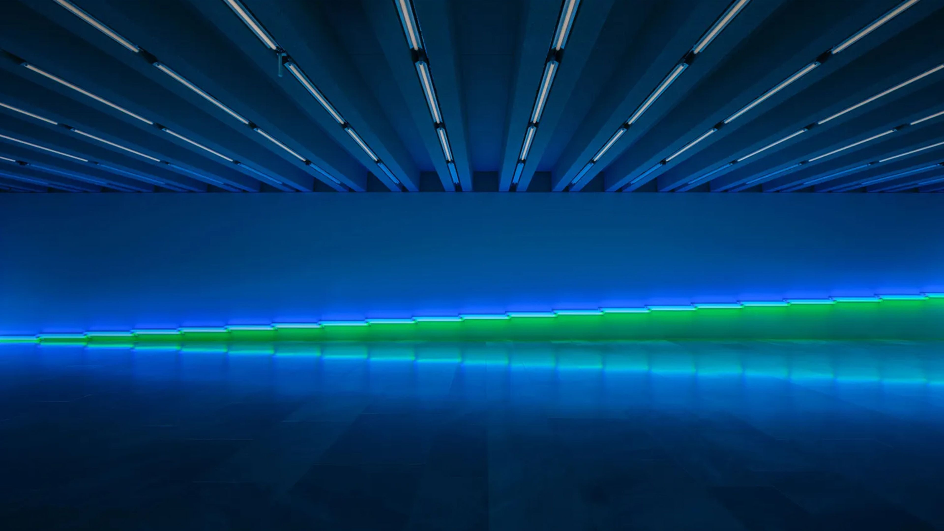
2018
Dan Flavin Reviewed in artnet
'Dan Flavin Lights Up Dia Beacon With Stunning Subterranean Installation' by Sarah Cascone
2016
Dan Flavin Profiled in artnet
'Minimalist Master of Light Dan Flavin' by Amah-Rose Abrams
2015
Dan Flavin Reviewed in Forbes
New Dan' Flavin Exhibit 'Corners, Barriers and Corridors' is as Beautiful as it is Conceptual' by Adam Lehrer
Dan Flavin Reviewed in The Brooklyn Rail
'Dan Flavin's Altering Light' by Greg Lindquist
2012
'Everything Is Illuminated' by Karen Rosenberg
Dan Flavin Featured in The New York Times
'The Morgan Will Show Another Side of Flavin' by Carol Vogel
2011