The artist on the works of J.M.W. Turner in a new essay
July 23, 2020
To be updated on upcoming exhibitions and other news, sign up to our newsletter here and follow us @davidzwirner.
On the occasion of At Sea, an online exhibition presenting over thirty works dating from the nineteenth century to the present in response to one of art’s oldest subjects, read a text by featured artist Cy Gavin on on the colors of J.M.W. Turner, and learning a new way of seeing.
1826 was an eventful year. As Charles Darwin sailed on HMS Beagle’s maiden voyage to Patagonia and Tierra del Fuego, French inventor, Nicephore Niépce, invented the first true photograph. A colorless and oily coal-tar derivative called aniline was isolated from the destructive distillation of indigo. Aniline could then be used to make the first synthetically produced blue, yellow and brown dyes for fabrics, inks and watercolors. Then French chemist Pierre-Jean Robiquet isolated alizarin, a red plant-derived pigment: the basis for a translucent crimson ubiquitous today. It is also the year J.M.W. Turner is thought to have completed his masterful watercolor flourish, Sea View. Turner’s social world included foremost scientists, naturalists, and inventors from London's Somerset House and the Royal Society, the United Kingdom’s national academy of science. At the Royal Society it would be common to attend lectures by towering figures like William Herschel, a builder of telescopes and an astronomer famous for his work on the Sun and for his discovery of Uranus. Apparently, the painting is dated to the 1820s in part by Turner’s choice to work on blue-toned paper. The paper automatically imparts midtones to sky and sea and Turner picks out the highlights of a blazing, but obscured, sun with opaque gouache and then enriches dark passages with richly saturated tones of translucent cobalt blue. In the last couple of years I’ve become increasingly fascinated by an optical phenomenon called the Purkinje Shift. It is the gradual, glitchy transition in color sensitivity in diminishing light. As light levels decrease, the human eye shifts in dominance to the blue end of the visible spectrum. As day turns to night, one kind of retinal cell (cones) yields to the other (rods), with rods interpreting texture in grayscale. The lack of color information making its way to our brains should not be mistaken for a lack of color in our darkened environment. My studio is a red barn in the woods somewhere. There are no streetlights and no ambient artificial lights. One evening, I was headed indoors at dusk and noticed, with alarm, that the red of the building and certain nearby flowers had turned a gray color rather than simply a darker shade of red. The green of the grass and other foliage looked like darker versions of themselves. This liminal period, which can last for many minutes is perceived by humans as a bluing out of the landscape and is called in navigational argot, Nautical Dusk, meaning just that the horizon and the brightest stars are simultaneously visible—useful for ship’s navigation. This effect was first noted in 1819, by Jan Evangelista Purkynje, a Czech anatomist. It bears mentioning that in my putting together this response, I learned that Purkynje was elected to the Royal Society in 1850, so may well have known Turner. Turner said, “I paint what I see, not what is there.” My encounter with the Purkinje Shift sparked an acceptance of color and perception as illusory experiences specific to our species and has fostered an excited interest in creating images that were made, at least in part, to be seen in low-light and meant to become activated at the brink of our ocular limits. There is great power in that which is indeterminate. I have begun re-considering colors imperceptible to the human eye, but which bookend our spectrum: infrared and ultraviolet. That we cannot see these colors doesn’t mean they are not colors. Infrared is perceptible through the heat it evolves and ultraviolet light is so effectual that when Sea View was gifted to the Scottish National Gallery in 1900 (along with a suite of thirty-seven other works), by a collector and personal friend of Turner’s, a stipulation was made that the works could only be shown for one month a year: January, when daylight was expected to be weakest. Upholding that mandate has protected the fugitive pigments in these watercolors from the typical blanching effects of UV light. Consequently, these works have an uncommon radiance that is thrilling to behold.
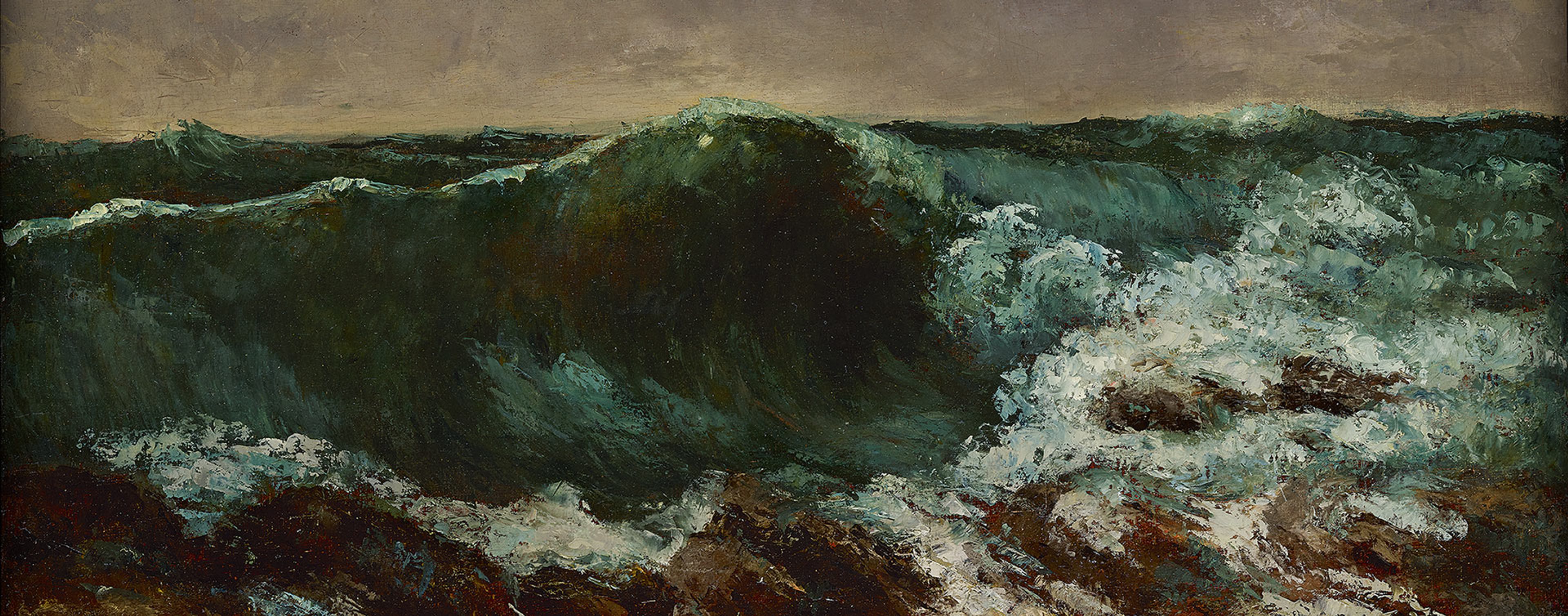
Image: Cy Gavin, Untitled (Wave Painting), 2020 (detail)