Ekphrasis on ekphrasis
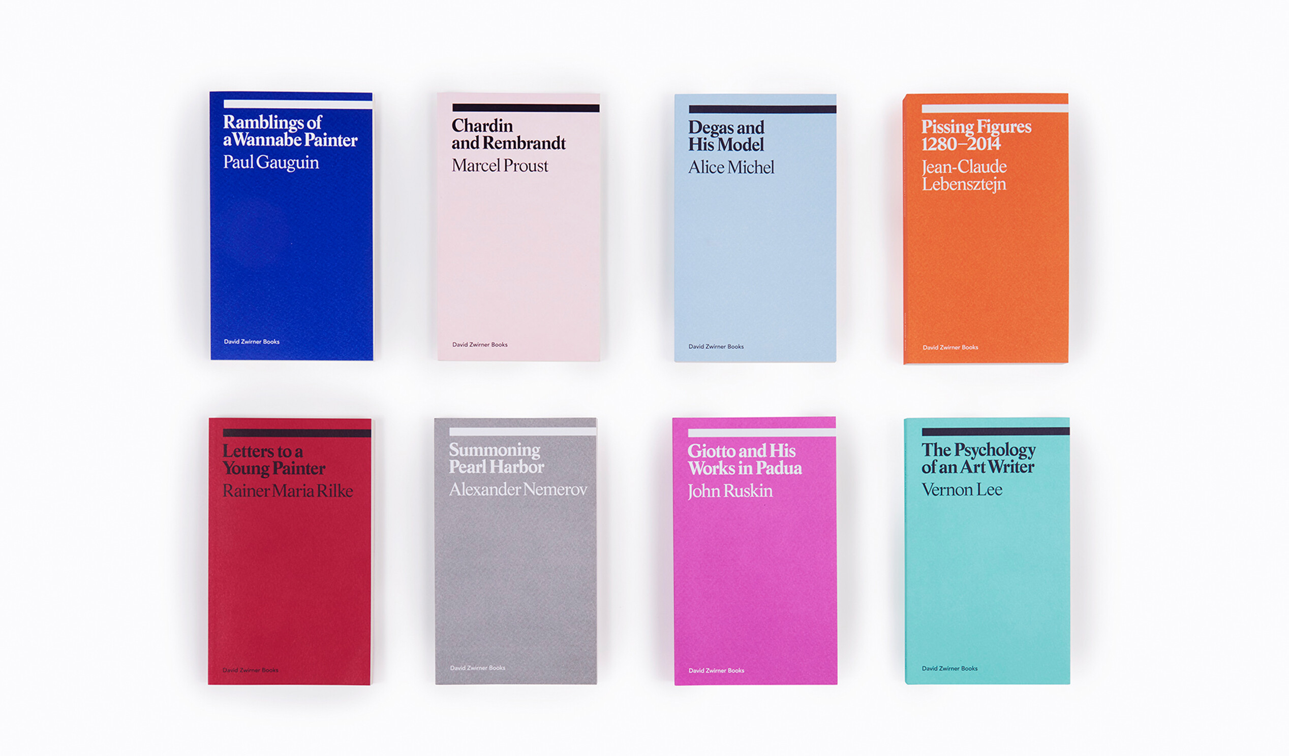
The ekphrasis series has become the cornerstone of David Zwirner Books, a locus of the imprint’s mission to publish rare, out-of-print, and newly commissioned texts with an eye toward exceptional design. These accessible paperback volumes, which fit neatly in the average back pocket, range from late-in-life musings on art criticism from French painter Paul Gauguin to an idiosyncratic history of urinating figures in art by Jean-Claude Lebensztejn to visceral first-hand accounts of experiences with great works of art by radical feminist aesthetician Vernon Lee. The ninth and tenth additions to the series—Duchamp’s Last Day by Donald Shambroom, published on the fiftieth anniversary of Marcel Duchamp’s death, and On Contemporary Art by Argentine writer César Aira—will be released this fall.
We asked Michael Dyer, principal of the Brooklyn-based design firm Remake, to share his thought process behind the series’ distinct design, and the challenges in creating a cohesive format that foregrounds such a wide-ranging collection of literary texts on visual culture.
How did you tackle the series as a whole? What did you have to take into consideration?
In general, we needed a system that could deal with quite a lot of variety but still feel coherent and pleasurable to read. The trim size, typography, and grid were the three essential ingredients. We explored a lot of options and settled on a pretty traditional pocket-sized format that was tweaked to have a nicer balance between the text and white space. This grid was then based on a series of classical proportional relationships between the margins, gutter, and column. The comparatively modern font, Arnhem, adds a twist to this traditional framework, and it also ensured good legibility at all sizes.

What have you learned from this process now that we are coming up on the ninth and tenth additions to the series?
If the system had been any tighter or more prescriptive when we designed it for the first two books, it would have become problematic in subsequent ones. The variety in content is considerable and became more complex over time, from young Proust’s torso of an essay, to Rilke’s letters to Balthus, and on to John Ruskin’s panel-by-panel explanation of Giotto’s frescoes.
I also think the approach to the covers—a rigorous type framework combined with changing colors—turned out to be key. The colors are so wonderful to see as the series grows, and the complex links between a specific color and its book are fascinating.
What is your favorite design element of the series?
This may sound a little silly, but my favorite part of the series’ design is just a plain old text spread. I like how modest and straightforward it is. The layout is an accrual of small decisions that harmonize and then completely recede, so the reader can simply take in the text.
How did you come up with the idea to include quotes on the back covers?
This was a group decision and ended up being quite meaningful. The selection of a compelling, representative quote is tricky, but when the right quote appears on the back cover, it adds quite a lot of intrigue. Although the back cover would look good as a field of color alone, I think the quote feels a bit more welcoming and gives a taste of what’s inside.
What is your favorite title in the series?
My favorite title is a toss-up between Pissing Figures and Giotto and His Works in Padua. Pissing Figures . . . well, it needs no explanation as to why it’s so entertaining. But I’d give the edge to the book on Giotto, just because what Ruskin is describing (the fresco cycle in the Scrovegni Chapel in Padua) is the single greatest work of art I’ve ever experienced. I own maybe a dozen books just on that chapel’s frescoes!
May 2018
“To quote George Orwell: every artist ‘has a ‘message’...”
Catch up on the latest season of Dialogues