David Zwirner is pleased to present Primary Colors, an exhibition of work by Josef Albers (1888–1976). Curated by Brenda Danilowitz, chief curator of The Josef and Anni Albers Foundation, the show is a focused examination of how the primary colors red, yellow, and blue, along with black, encompassed an infinite range of chromatic possibilities for Albers, which he explored throughout his career in stunning combinations presented in his signature visual formats. The exhibition coincides with a major retrospective exhibition of Albers’s and his wife and fellow artist Anni Albers’s art at the Institut Valencià d’Art Modern (IVAM), Valencia, Spain, which debuted at the Musée d’Art Moderne de Paris in 2021.
Josef Albers is considered one of the most influential abstract painters of the twentieth century as well as an important designer and educator. Albers’s artistic career, which bridged European and American modernism, consisted mainly of a tightly focused investigation into the perceptual properties of color and spatial relationships. Working with simple geometric forms, Albers sought to produce the effects of chromatic interaction, in which the visual perception of a color is affected by those adjacent to it. Albers’s precise application of color also created plays of space and depth, as the planar colored shapes that make up the majority of his works appear to either recede into or protrude out of the picture plane.
This exhibition will feature works by Albers from as early as the 1930s, a transitional period for the artist when he and Anni Albers immigrated to North Carolina, where they founded the art department at the famous Black Mountain College, and extending all the way to works he made shortly before his death in 1976. On view will be several paintings from Albers’s Homage to the Square series, his most celebrated body of work. These paintings were based on a nested square format that allowed Albers to experiment with endless chromatic combinations and perceptual effects. The artist has written about this work as follows: “Though the underlying symmetrical and quasi-concentric order of the squares remains the same in all paintings—in proportion and placement—these same squares group or single themselves, connect and separate in many different ways.”1 He has further written about how the colors in his paintings “are juxtaposed for various and changing visual effects. They are to challenge or to echo each other, to support or to oppose one another.… Such action, reaction, interaction—or interdependence—is sought in order to make obvious how colors influence and change each other; that the same color, for instance—with different grounds or neighbors—looks different.”2 Works from Albers’s Variant/Adobe series, inspired by the artist’s travels in Latin America, and from an early, rare group of paintings that depicts the visual motif of the treble clef as well as several important paintings and studies for unique works comprised of polygons and other geometric forms will also be presented, illustrating the breadth of his formal and chromatic range.
Elaborating on the significance of color, and the primary colors in particular, as exemplified in the selection of works that will be on view, Danilowitz writes:
For Albers color had agency that equaled the agency of living organisms. He wanted, he said, “to make my colors breathe.” Color should be active and alive to the viewer who would ideally have “eyes open to see.” Color could be sensual—soft, hard, embracing, intersecting, and penetrating. By the mid-twentieth century Albers knew and trusted his material so well that he was able to completely submerge his ego and leave it to the viewer to observe that the artist, having performed his experiments with care and attention, could stand back and allow the material alone to work its magic. “Color is a magic force,” he proclaimed.
Albers understood that “primary colors” were an idealized version of what color is: that color identity was a subjective phenomenon and contingent on the individual viewer. Color wheels and color charts were attempts to codify color in scientific ways that had little relevance for him, and he avoided them. “If one in a group says ‘red,’” he wrote, as a statement for a 1952 exhibition at the Sidney Janis Gallery in New York, “we can be sure that there are as many different conceptions of red as there are individuals in that group.” A red painting was never simply a red painting, and he would prove it by using three or four different reds in a single Homage to the Square painting and repeating this practice with a range of reds, over and over again. There is no “primary” red, or blue, or yellow.
Josef Albers (1888–1976) was born in Bottrop, Germany, and studied briefly at the Königliche Bayerische Akademie der Bildenden Künste, Munich, in 1919 before becoming a student at the Weimar Bauhaus in 1920. In 1922, Albers joined the school’s faculty, first working in stained glass and, starting in 1923, teaching design. During his time at Black Mountain College, Albers began to show his work extensively within the United States, including solo exhibitions at the Addison Gallery of American Art, Andover (1935); J. B. Neumann’s New Art Circle, New York (1936, 1938); The Germanic Museum at Harvard University, Cambridge (1936); Katharine Kuh Gallery, Chicago (1937); San Francisco Museum of Art (1940); and the Nierendorf Gallery, New York (1941). The Alberses remained at Black Mountain until 1949 and in 1950 moved to New Haven, Connecticut, where Josef Albers was invited to direct a newly formed department of design at Yale University School of Art. In 1950, too, he developed what would become his seminal Homage to the Square series, which he continued to elaborate until his death in 1976. This body of work was featured in a major exhibition organized by The Museum of Modern Art, New York, in 1964 that traveled to twenty-two venues in the United States and Latin America. Albers retired from teaching in 1958, a few years prior to the publication of his important text Interaction of Color (1963), which was reissued in two volumes in 2013. Following numerous gallery and museum exhibitions, as well as his participation in documenta 1 (1955) and documenta 4 (1968), Albers became the first living artist to be the subject of a solo exhibition at The Metropolitan Museum of Art, New York, with his career-spanning retrospective there in 1971.
More recent exhibitions include Painting on Paper: Josef Albers in America, which originated at the Pinakothek der Moderne, Munich, in 2010 (traveled to Josef Albers Museum, Quadrat, Bottrop, Germany; Louisiana Museum of Modern Art, Humlebæk, Denmark; Kunstmuseum Basel; Centre Georges Pompidou, Paris; Centro de Arte Moderna, Gulbenkian Museum, Lisbon; and the Morgan Library and Museum, New York); Josef Albers: Minimal Means, Maximum Effect at the Fundación Juan March, Madrid, in 2014 (traveled to Henie Onstad Art Centre, Høvikodden, Norway); and A Beautiful Confluence: Anni and Josef Albers and the Latin American World at MUDEC, Museo delle Culture, Milan, in 2015 to 2016. From 2016 to 2017, The Museum of Modern Art, New York, presented One and One Is Four: The Bauhaus Photocollages of Josef Albers. In 2017, Josef Albers in Mexico was presented at the Solomon R. Guggenheim Museum in New York and traveled to the Peggy Guggenheim Collection in Venice in 2018. Anni and Josef Albers: Art and Life is currently on view through January 9, 2022 at the Musée d’Art Moderne de Paris, and opens at Institut Valencià d’Art Modern (IVAM), Valencia, Spain, on February 15, 2022.
Since May 2016, The Josef and Anni Albers Foundation has been exclusively represented by David Zwirner. The gallery’s first solo exhibition of Albers’s work, Grey Steps, Grey Scales, Grey Ladders in New York in 2016, was followed by Sunny Side Up at the London gallery in 2017, and Sonic Albers, which was on view in New York in 2019. Albers and Morandi: Never Finished, an exhibition exploring the visual and formal affinities and contrasts between the work of Albers and Giorgio Morandi, was on view in New York in 2021.
1 Josef Albers, “On My Homage to the Square” (c. 1954), first published in Josef Albers on His Seventieth Birthday. Exh. cat. (Freiburg: Kunstverein Freiburg, 1958), pp. 14–15, reprinted in Nicholas Fox Weber et al., Josef Albers: Minimal Means, Maximum Effect. Exh. cat. (Madrid: Fundación Juan March, 2014), p. 279.
2 Josef Albers, “The Color in My Painting” (c. 1954), first published in Josef Albers on His Seventieth Birthday, pp. 14–15, reprinted in Josef Albers: Minimal Means, Maximum Effect, p. 277.
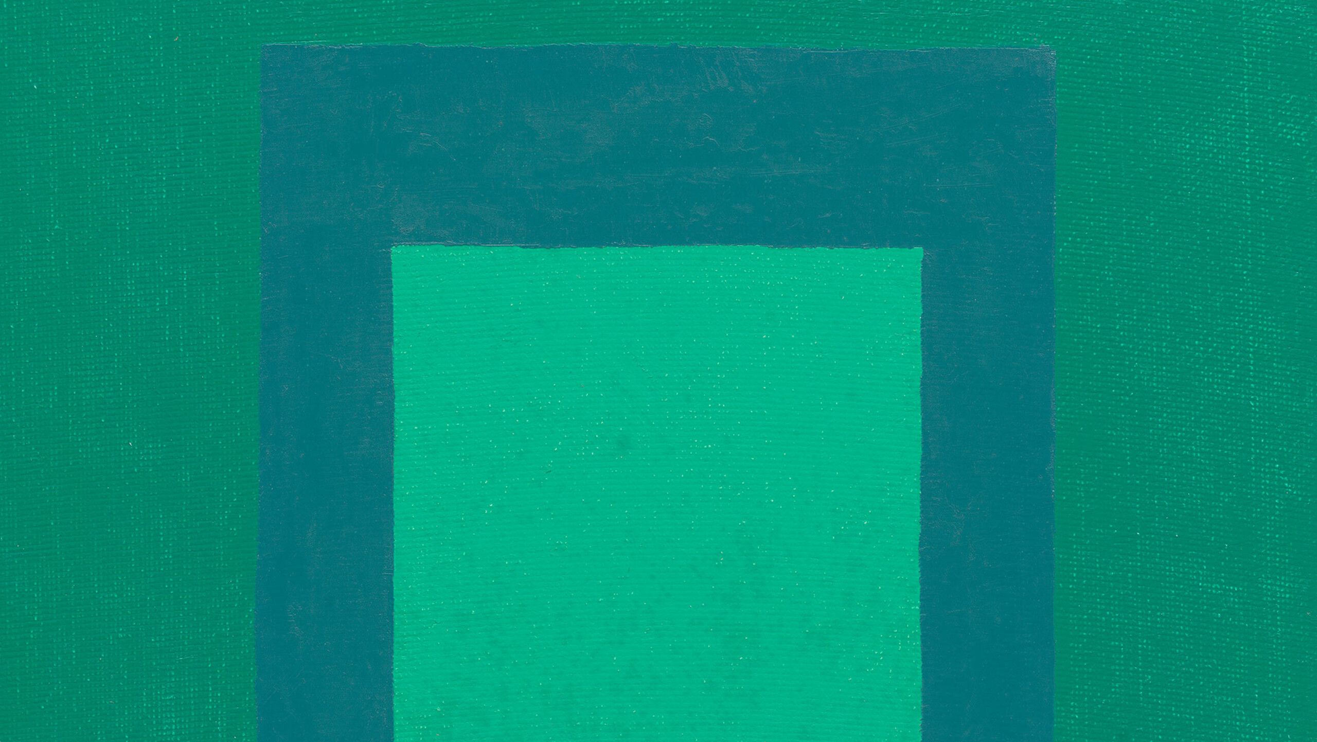
Image: Josef Albers, Study for Homage to the Square, 1963 (detail).
For all press inquiries, contact:
Julia Lukacher +1 212 727 2070 jlukacher@davidzwirner.com
Victoria Kung +852 9668 1092 victoriak@suttoncomms.com
Kiko Tse +852 6015 5184 kiko@davidzwirner.com
約瑟夫·阿爾伯斯:原色
Josef Albers: Primary Colors
2022年1月18日 - 3月5日
香港中環皇后大道中80號
H Queen’s 5至6樓
卓納畫廊欣然呈現藝術家約瑟夫·阿爾伯斯(又譯:約瑟夫·亞伯斯,Josef Albers,1888–1976)的作品展《原色》。由約瑟夫與安妮·阿爾伯斯基金會的首席策展人布蘭達·丹尼羅威茨(Brenda Danilowitz)策劃,聚焦於紅、黃、藍、黑等原色是如何為阿爾伯斯的創作帶來了無限的色彩可能性。藝術家在整個職業生涯中持續對色彩進行探索,並以標誌性的視覺形式呈現出令人驚嘆的構圖組合。此次展覽恰逢西班牙IVAM瓦倫西亞現代藝術館正在為阿爾伯斯及其妻子、藝術家安妮·阿爾伯斯的藝術創作舉辦大型回顧展,該展覽於2021年首展於巴黎的市立現代美術館。
約瑟夫·阿爾伯斯被公認為二十世紀最具影響力的抽象畫家之一,同時也是一位重要的設計師和教育家。他的藝術生涯將歐洲及美國的現代主義嫁接起來,專注於研習色彩與空間關係所帶來的感知體驗。阿爾伯斯擅長運用簡潔的幾何形式,讓色彩產生相互作用,以此探究一種顏色受相鄰色彩影響而帶給觀眾的不同感受。他以精準的色彩應用創造出空間與縱深的張力,使得作品中那些平坦的色彩形狀顯現出或後退,或凸出的視覺效果。
此次展覽呈現了阿爾伯斯創作於1930年代的早期作品——正值他和安妮·阿爾伯斯移居北卡羅來納州的轉折時期,他們在著名的黑山學院創立了藝術系——一直延伸到他在1976年去世前不久的創作。展覽中的不少畫作出自阿爾伯斯最為知名的《向方形致敬》系列,這些作品的構圖基於一組呈嵌套狀排布的正方形,使阿爾伯斯得以充分試驗無盡的色彩組合及其感知效果。藝術家曾如是描述這組作品:「儘管就其比例和佈局而言,系列裡所有畫面中的正方形都具有相同的對稱及同心排布的秩序,但這些相同的正方形或形成組合或單獨成立,它們以不同的方式彼此聯接或離散。」【1】他還進一步闡釋自己繪畫中的色彩是如何地「並置在一起從而產生各種變化的視覺效果。它們互相挑戰、或作出呼應,彼此支撐、或相互反對。……這樣的動態、反饋、互動——或者說相互依存——使得色彩的交互影響與變化更為鮮明;同一種顏色,會因為放置在構成各異的背景或相鄰色之間而看起來全然不同。」【2】展覽還呈現了阿爾伯斯《變體/粘土》系列中的作品,創作靈感來自藝術家前往拉丁美洲的遊歷,此外也包括了一組罕見的以高音譜號為視覺主題進行描繪的早期繪畫,以及另外幾幅由多邊形和其他幾何形態構成的重要繪畫和習作,它們共同展現了阿爾伯斯的創作在形式和色彩探索方面的廣度。
策展人丹尼羅威茨詳細闡述了顏色、尤其是原色對阿爾伯斯而言的重要性,這種重要突顯於此次展覽之中:
對阿爾伯斯來說,色彩發揮著與鮮活的生命體類同的作用。他說,他想「讓我的色彩呼吸」。對於那些在理想情況下「睜開雙眼觀看」的觀眾而言,色彩是生動活躍的。色彩可以是感性的——柔軟、堅硬、相擁包容、彼此交叉並且滲入人心。 20世紀中期時,阿爾伯斯熟稔並堅信自己的材料,以至於他能夠將自我全然地淹沒其中,留待觀看者去觀察藝術家如何在小心翼翼地進行了試驗之後向後退隱,並且任由材料獨自揮發魔力。 「色彩是一種神奇的力」,他這樣宣告。
阿爾伯斯視「原色」為色彩的理想形式:色彩的身份是一種主觀的現象,而且取決於個體的觀看者。顏色輪盤及色譜表試圖以與他無關的科學方式編纂色彩,而他對此則避而遠之。 「如果某個群體中的一個人說『紅色』」,阿爾伯斯在1952年為舉辦於紐約悉尼·賈尼斯畫廊(Sidney Janis Gallery)的展覽所做的陳述中寫道,「我們可以肯定,群體中有多少個體就會有多少種關於紅色的不同理解。」一幅紅色的繪畫從來不只是一幅紅色繪畫,他會在一件《向方形致敬》的作品中採用三四種不同的紅色,並且反复地使用各种红色一遍遍地實踐,以此來證明這一點。從來沒有「原色」的紅,也沒有原色的藍或黃。
註釋
【1】約瑟夫·阿爾伯斯,《關於我<向方形致敬>的系列》(約1954年),首次出版收錄於《約瑟夫·阿爾伯斯寫作於他七十歲生日之際》,展覽圖冊(英語版;弗萊堡:弗萊堡藝術協會出版,1958年),第14-15頁;再版收錄於尼古拉斯·福克斯·韋伯(Nicholas Fox Weber)等人合著的《約瑟夫·阿爾伯斯:極簡的方式,極繁的效果》,展覽圖冊(馬德里:胡安·馬奇基金會出版,2014年),第279頁。
【2】約瑟夫·阿爾伯斯,《我繪畫中的色彩》(約1954年),首次出版收錄於《約瑟夫·阿爾伯斯寫作於他七十歲生日之際》,第14-15頁;再版收錄於《約瑟夫·阿爾伯斯:極簡的方式,極繁的效果》,第277頁。
約瑟夫·阿爾伯斯(Josef Albers, 1888-1976)出生於德國博特羅普(Bottrop),曾在1919年短暫求學於慕尼黑的皇家巴伐利亞美術學院,並在1920年入學魏瑪包豪斯大學。 1922年,阿爾伯斯留校任教,起先專注於彩色玻璃,自1923年起教授設計專業。在黑山學院任教期間,阿爾伯斯開始廣泛地在美國展出作品,包括舉辦於安多弗美國艾迪生藝術館(1935)、紐約J.B.·諾依曼的「新藝術圈」機構(1936和1938)、位於劍橋哈佛大學的德國博物館(1936)、芝加哥的凱瑟琳·庫赫畫廊(1937)、舊金山藝術博物館(1940)以及紐約尼爾倫多夫畫廊(1941)等機構的個展。阿爾伯斯夫婦一直在黑山學院生活到了1949年,並於1950年搬往康涅狄格州的紐黑文,在那裡,約瑟夫·阿爾伯斯受邀擔任耶魯大學藝術學院新近成立的設計系的主任。同樣是在1950年,他開始發展日後成為其最具影響力的《向方形致敬》系列,藝術家持續於這個系列的創作直至他離世的1976年。這組作品曾在1964年展出於紐約現代藝術博物館組織的一次大型展覽,並在此後巡展至美國和拉丁美洲的二十二個場館機構。 1958年,阿爾伯斯從教職崗位上退休,幾年後他的重要文本《色彩的相互作用》(1963)出版發表,這本著作在2013年以二卷本的形式重版。繼無數畫廊及博物館的展覽以及他在第一屆文獻展(1955)和第四屆文獻展(1968)的亮相之後,阿爾伯斯成為了首位在紐約大都會藝術博物館舉辦個展的在世藝術家,這場縱覽其創作生涯的回顧展舉辦於1971年。
阿爾伯斯的近期展覽包括:《紙本版畫:約瑟夫·阿爾伯斯在美國》,展覽源起於2010年慕尼黑的現代藝術陳列館(後巡展至德國博特羅普的約瑟夫·阿爾伯斯博物館、丹麥胡姆勒拜克的路易斯安娜現代藝術博物館、巴塞爾藝術博物館、巴黎的蓬皮杜藝術中心、里斯本的古爾班基安博物館現代藝術中心、紐約的摩根圖書館與博物館);《約瑟夫·阿爾伯斯:極簡的方式,極繁的效果》,展覽於2014年在馬德里的胡安·馬奇基金會舉辦(後巡展至挪威霍維克登的海涅昂斯塔德藝術中心);以及《美麗的匯合:安妮與約瑟夫·阿爾伯斯以及拉丁美洲的世界》,展覽與2015至2016年舉辦於米蘭的MUDEC文化博物館。 2016至2017年,紐約現代藝術博物館呈現了《一加一等於四:約瑟夫·阿爾伯斯的包豪斯攝影拼貼作品展》。 2017年,紐約的古根海姆美術館呈現了展覽《約瑟夫·阿爾伯斯在墨西哥》,並在2018年巡展至威尼斯的佩吉·古根海姆收藏館。 《安妮與約瑟夫·阿爾伯斯:藝術與生活》正在巴黎的市立現代美術館呈現,展期直至2022年1月9日,並將在2022年2月15日於西班牙IVAM瓦倫西亞現代藝術館開幕。
自2016年5月開始,約瑟夫與安妮·阿爾伯斯基金便由卓納畫廊獨家代理。阿爾伯斯的作品在畫廊的首展《灰色進階、灰色體量、灰色階梯》於2016年舉辦於紐約;2017年,畫廊的倫敦空間為其舉辦了個展《向上的陽光》;2019年,紐約空間舉辦了《音速阿爾伯斯》。 2021年舉辦於紐約的畫廊展覽《阿爾伯斯與莫蘭迪:永不終結》探索了阿爾伯斯與喬治·莫蘭迪(Giorgio Morandi)兩人作品之間在視覺和形式上的相似與反差。
媒体垂询
谢鹄怡 +852 6015 5184 kiko@davidzwirner.com
龚凯欣 +852 9668 1092 victoriak@suttoncomms.com
Julia Lukacher +1 212 727 2070 jlukacher@davidzwirner.com